Copyright: Jurgen Partenheimer,Fair Use
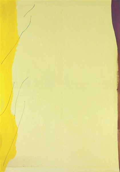
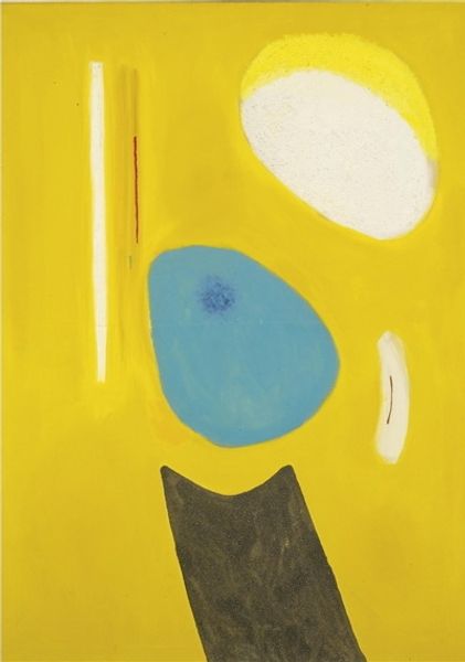
Editor: We're looking at "Gelb 1. 90.38" created in 1990 by Jurgen Partenheimer using acrylic paint. I'm struck by the contrast between the textured yellow and the cool gray areas; there's also that intriguing black line and white rectangle disrupting the space. What compositional elements stand out to you? Curator: The dynamic between surface textures and geometric intrusions offers an interesting tension. Note the contrast, how the fluid application of the yellow acrylic clashes against the hard-edged rectangle, interrupting the eye. The texture, built up by the paint itself, contrasts sharply with the relative flatness of the line and rectangle. Do you see a connection in these visual disruptions? Editor: I see that both the line and rectangle break up the composition and add contrast, but how do you think they function formally? Curator: The line acts as a counterweight to the expansive yellow field, preventing the composition from becoming static, providing a vertical trajectory. Simultaneously, the placement of the rectangle near the painting's upper third creates an almost architectural division of space. We are left with the question of where the picture plane truly resides and where our visual attention rests. Does this structured arrangement resonate with you? Editor: Absolutely, I can now appreciate the considered use of seemingly disparate elements, like color and shape, which gives the painting its structure. It feels a lot more intentional than I initially thought. Curator: Indeed. Through careful consideration of colour, texture and shape the painting creates an ordered experience.
Comments
No comments
Be the first to comment and join the conversation on the ultimate creative platform.
More like this