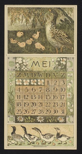
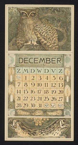
print, linocut
#
art-nouveau
# print
#
linocut
#
landscape
#
bird
#
linocut print
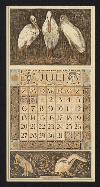
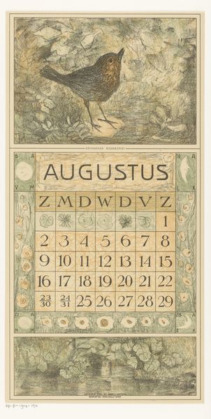
Dimensions: height 418 mm, width 211 mm
Copyright: Rijks Museum: Open Domain
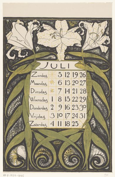
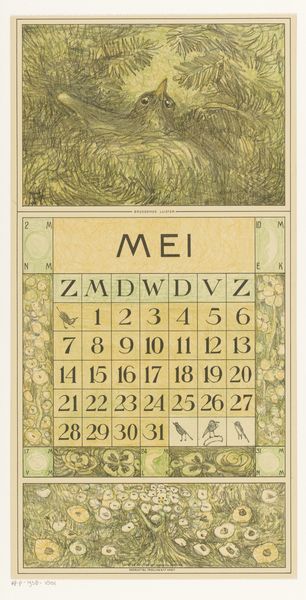
Theo van Hoytema made this calendar for July 1914 with ink and graphite on paper, and it’s all about the tender balance between precision and play. I’m really drawn to the way he uses line – it's not just about defining shapes, but also about creating texture and atmosphere. Look at the bird nestled among the flowers at the top. See how Hoytema uses these tiny, almost scribbled lines to build up the bird's form, giving it a sense of depth and softness? It's like he's trying to capture the feeling of feathers rather than just drawing what they look like. The limited palette, mostly muted greens and browns, adds to this intimate, almost hushed feeling. You can feel the influence of Japanese prints here, but there’s also something uniquely personal about the way Hoytema approaches his subject. It reminds me a bit of the work of Aubrey Beardsley. Both artists share this incredible attention to detail, but also a willingness to let the line wander and explore. Art is about embracing ambiguity, right?
Comments
No comments
Be the first to comment and join the conversation on the ultimate creative platform.
More like this