Copyright: CC0 1.0
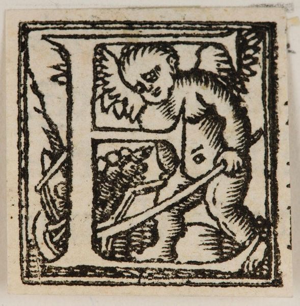
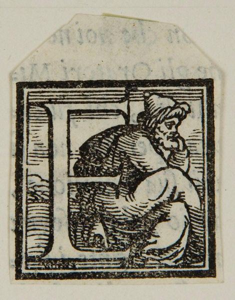
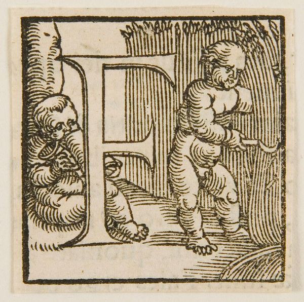
Editor: Here we have a print called Letter F, by an anonymous artist. The stark black and white creates a striking contrast. What stylistic elements stand out to you? Curator: Observe how the composition hinges on the interplay between positive and negative space. The letterform itself is rendered in negative space, defined by the dense hatching that articulates the figure and the surrounding environment. Note the strategic use of line to create texture and volume. Editor: I see. So the hatching gives dimension to the figure? Curator: Precisely. And consider how the figure interacts with the letter. It becomes an integral part of its structure. The linear precision suggests a craftsman's intent. Editor: It's amazing how much detail there is. Thanks for pointing those things out. Curator: My pleasure. It highlights the importance of careful observation.
Comments
No comments
Be the first to comment and join the conversation on the ultimate creative platform.
More like this