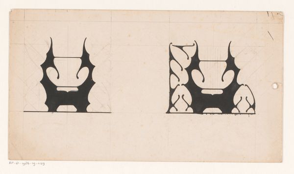
drawing, paper, ink
#
drawing
#
art-nouveau
#
ink paper printed
#
light coloured
#
paper
#
ink
#
geometric
#
decorative-art
Dimensions: height 98 mm, width 147 mm
Copyright: Rijks Museum: Open Domain
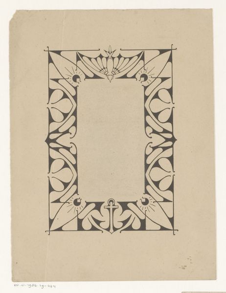
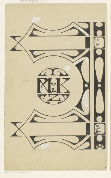
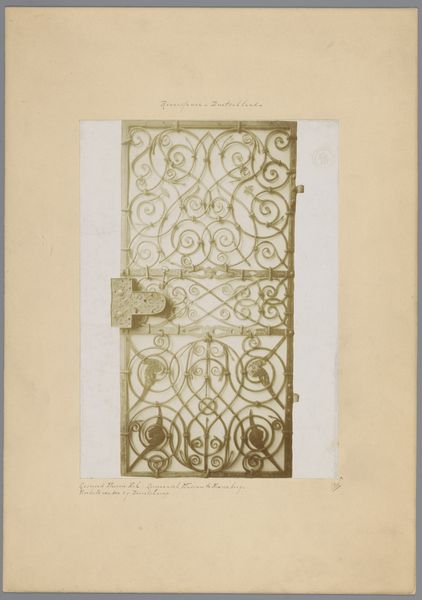
Curator: This is “Kader,” a drawing created with ink on paper by Reinier Willem Petrus de Vries, some time between 1884 and 1952. Editor: It strikes me as clean, even stark. The contrast between the black ink and light-colored paper is quite arresting. A bit cold, maybe. Curator: Given de Vries's background in decorative arts and the Art Nouveau movement, one can examine it as a study in stylization and pattern-making. Think about the availability and production of ink and paper at the time. What sorts of social functions would an object like this fulfill? Editor: Presumably it served as an element for a printed graphic? I wonder how much art like this permeated public consciousness during its time. It presents very pure geometric forms alongside the organic curves characteristic of Art Nouveau. The context would reveal its cultural purpose, and how it helped shape a collective visual language. Curator: Right. The materials themselves suggest reproducibility and mass consumption. Paper, in particular, implies dissemination. This isn’t a precious oil painting destined for a wealthy patron's private collection. It’s designed, materially and aesthetically, for a broader audience, engaging with trends in printing technology, typography and design choices available for different segments of the Dutch publishing world. Editor: So it's less about individual expression and more about the accessibility of imagery within society? How did the distribution networks for printed materials influence the visibility, or perhaps even the *acceptability*, of such styles in the Netherlands, specifically during this period? The geometric approach seems modern and intentional in that regard. Curator: Precisely! It would be interesting to examine the commercial spaces—galleries, print shops, expositions—where something like this would have been presented and circulated and how these shaped its interpretation. How this intersects class divisions is critical to unpacking art such as this. Editor: Considering how much this geometrical language contrasts the art production coming out of, say, The Hague school, helps in framing this image historically. Curator: Indeed, it all returns to understanding production—not just of the object, but of taste itself. Editor: I see this as a historical marker that speaks about social change and innovation. Curator: And I see its materials whispering the same story.
Comments
No comments
Be the first to comment and join the conversation on the ultimate creative platform.
More like this