drawing, paper, ink, pen
#
portrait
#
drawing
#
hand-lettering
#
hand drawn type
#
hand lettering
#
paper
#
ink
#
pen work
#
pen
#
handwritten font
#
modernism
Copyright: Rijks Museum: Open Domain
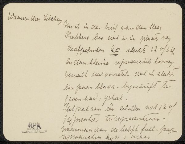
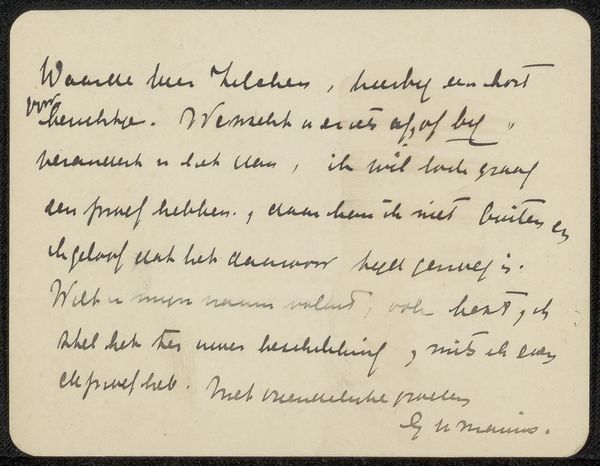
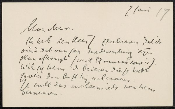
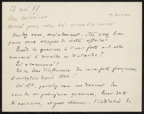
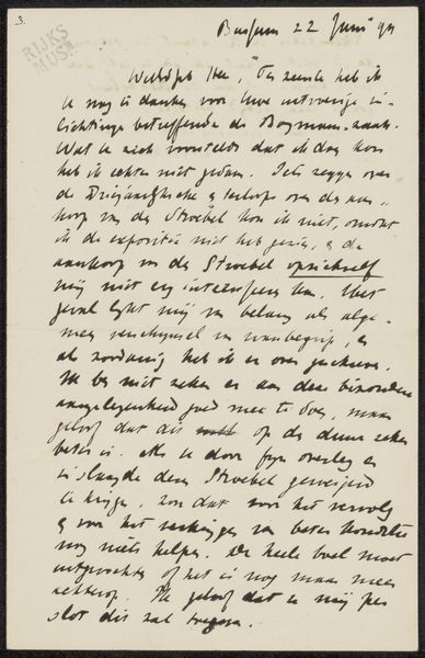
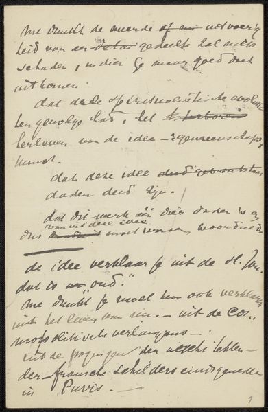
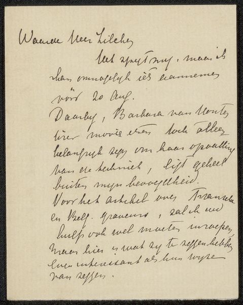
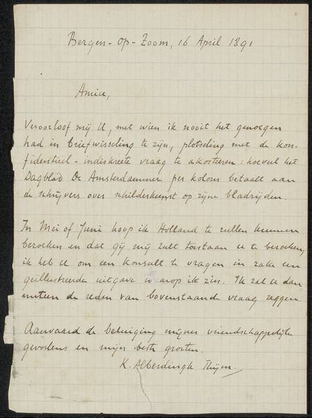
Editor: We're looking at "Brief aan Philip Zilcken," a drawing possibly from 1909 by Frits Lapidoth. It’s ink on paper, and it’s… well, it's a handwritten letter. It's interesting how the artist chose handwriting as a medium; it makes me wonder what it says! How do you interpret this work as a portrait or personal expression beyond just a letter? Curator: Ah, this isn't just ink on paper, it's a captured moment, a fragment of conversation plucked from the past. It’s more than mere words; it's about intimacy, about the nuances lost in printed type. See the flow of the script, the pressure of the pen? Lapidoth isn’t just informing Zilcken; he's inviting him into his thoughts, his very presence is evoked by this "portrait." Handwriting reveals so much, doesn’t it? It whispers secrets a typed font never could. It’s a unique impression. I wonder what other messages the artist delivered through the handwritten word? Editor: I never thought of it that way, as a kind of intimate self-portrait through script. The imperfections, the flow, all saying something beyond the words themselves... that makes the "medium" feel more meaningful. What strikes you most about the visual form beyond the content? Curator: For me, it’s the imperfection – that tremor in the hand, the barely legible word hinting at urgency. And what a sense of modernity it evokes through an exchange between artists of the time, which Lapidoth includes. We all use this form, this method of recording our inner thoughts and emotions on paper; a sort of time machine made of ink, what do you think? Editor: I love that description—a time machine made of ink! Thanks; I am viewing it totally differently now!
Comments
No comments
Be the first to comment and join the conversation on the ultimate creative platform.
More like this