About this artwork
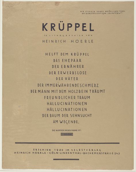
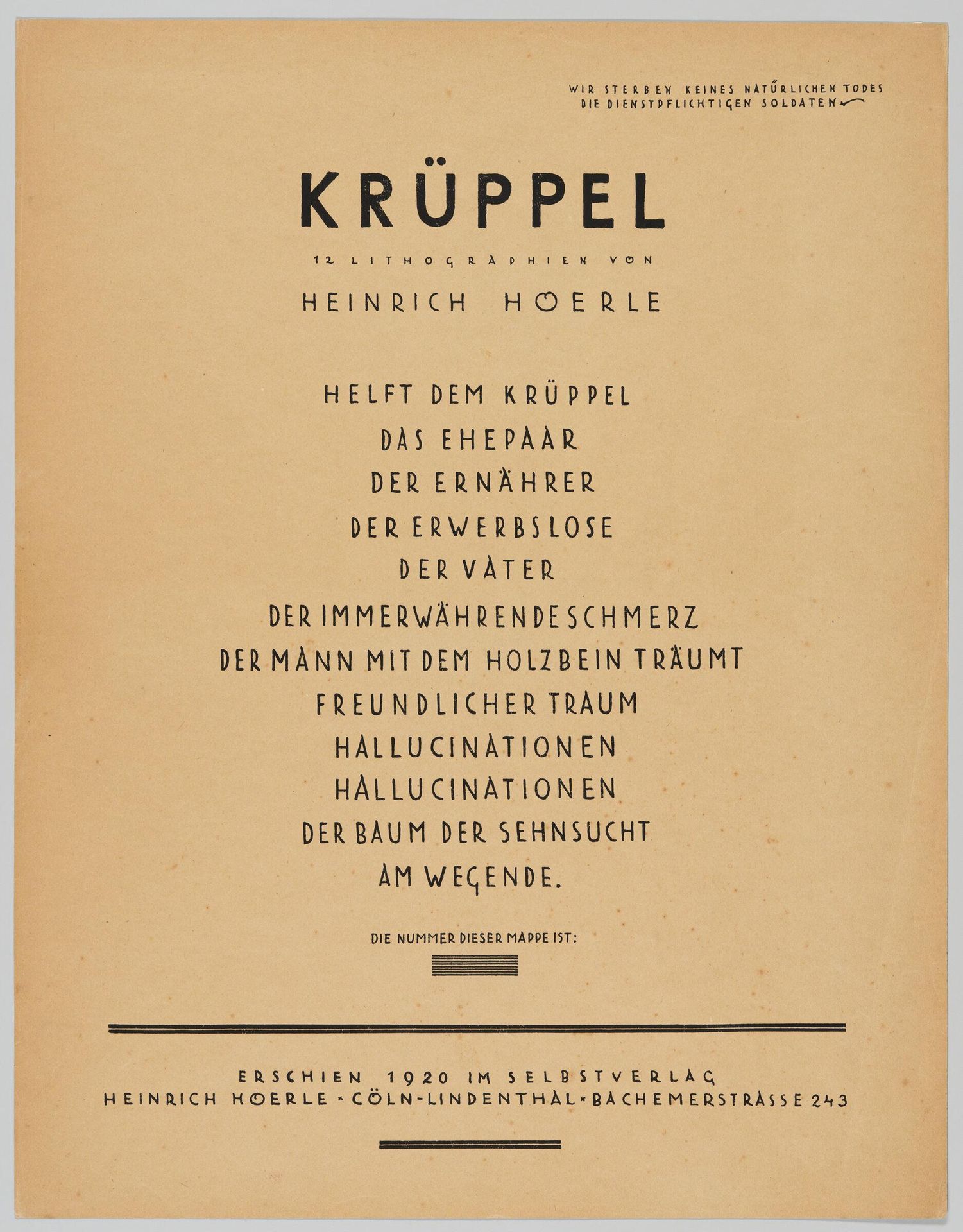
Editor: This is the title page for "Kruppel," or "Cripples," a portfolio of lithographs by Heinrich Hoerle from 1920. The typography is so stark, almost bureaucratic. What structural elements strike you most powerfully? Curator: The composition immediately suggests a hierarchy through its arrangement of text. Note the bold, capitalized title, then the cascading phrases beneath. The visual weight diminishes as we descend, creating a sense of pathos, wouldn't you agree? Editor: I do. It’s like a list of grievances, visually weighted by font size and leading. The title, acting as a superordinate signifier. Curator: Precisely. Hoerle uses typography not just to convey information, but to construct a visual argument about the dehumanizing consequences of war. Observe how the font choices contribute to this effect. Editor: So, the piece is less about the literal meaning of the words and more about how they are presented and arranged? I now understand better that the medium is the message. Curator: Indeed. And understanding that relationship is key to unlocking Hoerle's intent.
Artwork details
- Dimensions
- 59.2 Ã 46 cm (23 5/16 Ã 18 1/8 in.)
- Location
- Harvard Art Museums
- Copyright
- CC0 1.0
Comments
Share your thoughts
About this artwork
Editor: This is the title page for "Kruppel," or "Cripples," a portfolio of lithographs by Heinrich Hoerle from 1920. The typography is so stark, almost bureaucratic. What structural elements strike you most powerfully? Curator: The composition immediately suggests a hierarchy through its arrangement of text. Note the bold, capitalized title, then the cascading phrases beneath. The visual weight diminishes as we descend, creating a sense of pathos, wouldn't you agree? Editor: I do. It’s like a list of grievances, visually weighted by font size and leading. The title, acting as a superordinate signifier. Curator: Precisely. Hoerle uses typography not just to convey information, but to construct a visual argument about the dehumanizing consequences of war. Observe how the font choices contribute to this effect. Editor: So, the piece is less about the literal meaning of the words and more about how they are presented and arranged? I now understand better that the medium is the message. Curator: Indeed. And understanding that relationship is key to unlocking Hoerle's intent.
Comments
Share your thoughts