drawing, graphite
#
portrait
#
pencil drawn
#
drawing
#
baroque
#
pencil sketch
#
charcoal drawing
#
pencil drawing
#
graphite
#
portrait drawing
#
pencil work
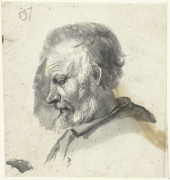
Dimensions: height 94 mm, width 73 mm
Copyright: Rijks Museum: Open Domain
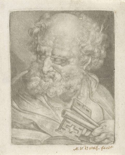
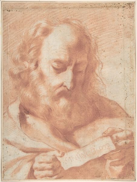
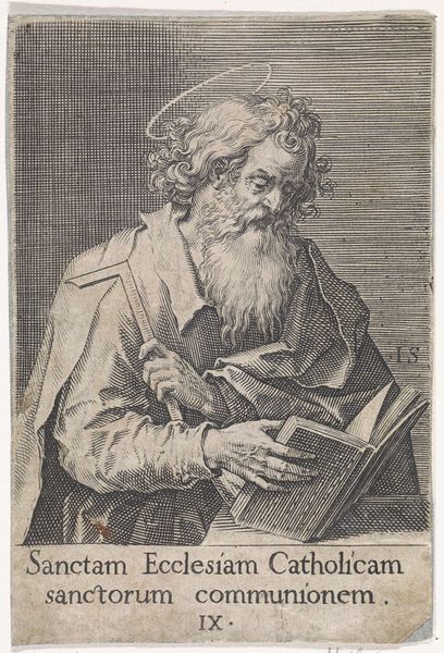
Editor: So, this is Adriaen van der Werff’s “Apostel Petrus,” a drawing in graphite created sometime between 1669 and 1722. There’s such a soft quality to the lines. It’s surprisingly gentle given the subject. What catches your eye? Curator: It's fascinating how van der Werff utilizes the baroque style, traditionally associated with grand displays of power, to portray such an intimate scene. Note the inclusion of the keys, symbolizing Peter's role as the gatekeeper of heaven. But the institutional power of the church at that time – how does it filter into this intensely private depiction? Editor: You mean like, is he presented as this imposing figure *because* of that institutional power? Or is the power more subtle? Curator: Precisely. Is this intended to project the authority of the church, or is it a more nuanced exploration of faith and the human condition? Look at how the gaze is directed downward, almost introspective. Was this drawing, perhaps, a reflection on the evolving relationship between religion, art, and patronage? Editor: It almost makes him seem… vulnerable? I hadn't considered how that plays into the institution. Curator: And who would have been viewing such an image? These weren't mass-produced prints; this was likely intended for a specific, educated audience familiar with both art and religious iconography. What did *they* bring to their viewing of the drawing? Editor: Thinking about it that way, it really complicates the initial impression I had. It's much more layered than I first thought. Thanks for that! Curator: Of course! It's always about peeling back the layers, questioning the narrative, and understanding the sociopolitical context within which the artwork exists.
Comments
No comments
Be the first to comment and join the conversation on the ultimate creative platform.
More like this