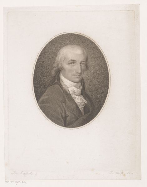
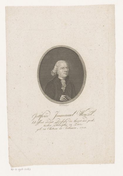
Jan van Son c. 18th century
Copyright: CC0 1.0
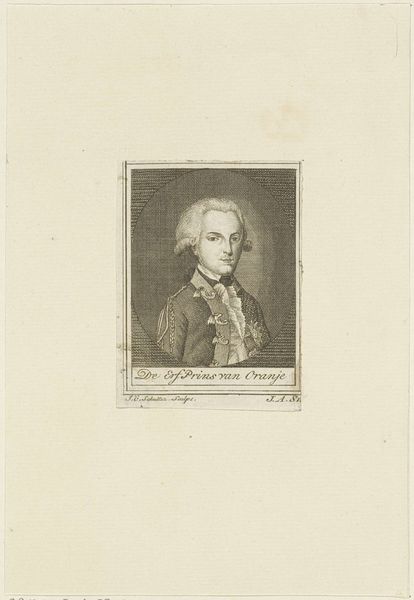
Editor: Here we have Alexander Bannerman's "Jan van Son," a portrait print from the 18th century. The detail is incredible. What do you see in the composition, particularly in the linework? Curator: Indeed. Note the crispness of the engraving. Bannerman masterfully uses hatching and cross-hatching to define form and texture. Consider how the density of lines shapes the face and drapery versus the smoother background. Editor: So the variation in line work creates depth and focus? Curator: Precisely. Observe how the oval border, rendered with simple parallel lines, contrasts with the intricate portrait. It directs our gaze inward, focusing attention on the subject's expression and attire. Did Bannerman achieve a sense of realism with this simple method? Editor: Definitely! I see how focusing on the artistic elements creates meaning in this work. Thanks for sharing your insight! Curator: A pleasure. Recognizing the language of line and form unlocks a deeper appreciation for the artist's skill.
Comments
No comments
Be the first to comment and join the conversation on the ultimate creative platform.
More like this