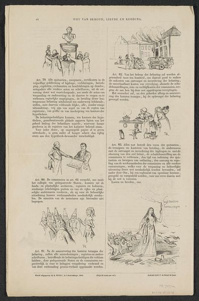
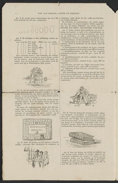
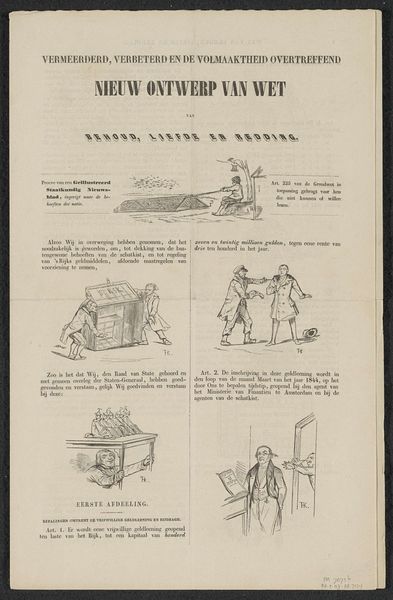
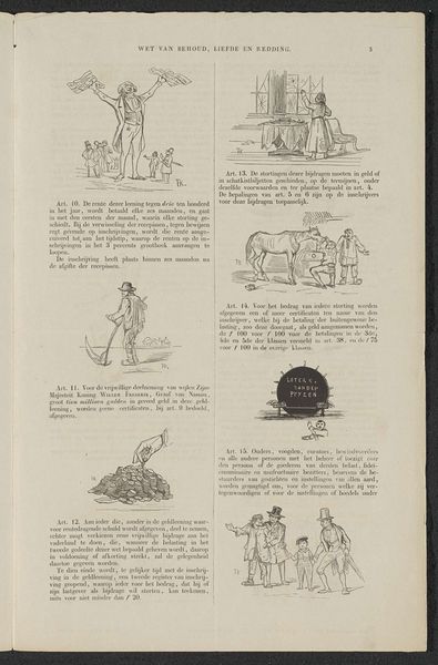
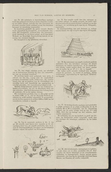
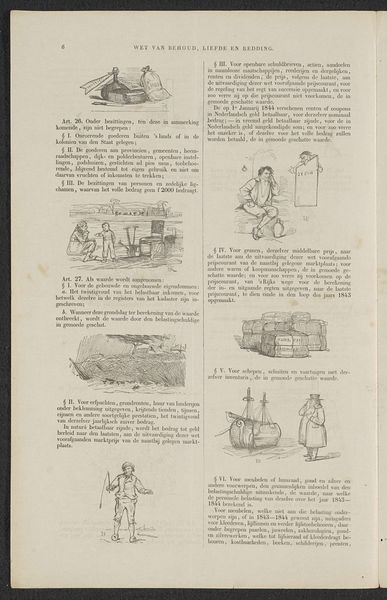
Satire op de aansporing tot deelneming in de (zogenaamde) vrijwillige 3% geldlening van 1844 (blad 10) 1844
0:00
0:00
hermanfrederikcareltenkate
Rijksmuseum
drawing, print, engraving
#
drawing
#
dutch-golden-age
# print
#
engraving
Dimensions: height 385 mm, width 245 mm
Copyright: Rijks Museum: Open Domain
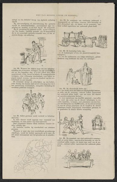
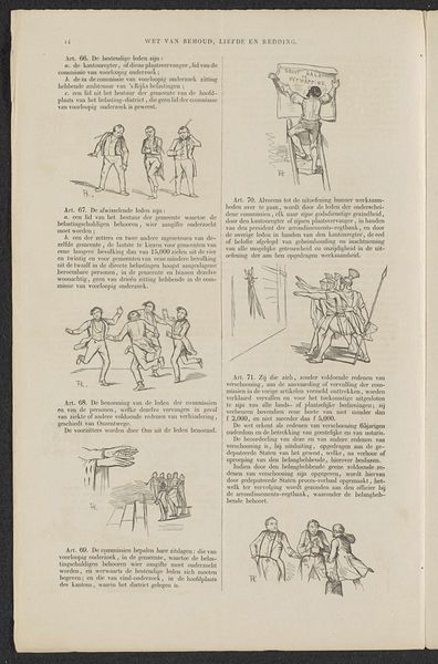
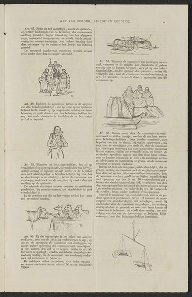
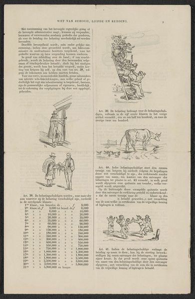
Curator: Here we have "Satire op de aansporing tot deelneming in de (zogenaamde) vrijwillige 3% geldlening van 1844 (blad 10)", a print made in 1844 by Herman Frederik Carel ten Kate, currently residing at the Rijksmuseum. The details in the engraving make it appear quite intricate, although perhaps overwhelming at first glance. What are your initial impressions? Editor: The density of the images is a bit challenging, yes! It feels a bit like a page from a textbook, or maybe sheet music, with all these separate vignettes placed seemingly without order. With your expertise, can you illuminate some of its underlying structural and semiotic qualities? Curator: Indeed. Consider this arrangement as a structured composition in itself. The placement of each smaller image interacts to convey meaning. Do you observe any recurring visual motifs or organizational logic as you examine the print? Editor: Well, there’s a progression, maybe? Starting from top-left we have what appears to be an appeal and reading downwards they become increasingly… satirical? I mean the figures become less realistic, and, at the bottom right, seems like they’re not even human anymore. Curator: An astute observation. These contrasting representational styles serve as a form of visual rhetoric. Can you identify specific artistic elements such as line quality or tonal variations that underscore the contrast? Editor: The earlier images do seem sharper, using more precise lines and hatching, giving them a more polished, realistic appearance. The later ones, particularly those with the animal figures, employ looser linework. The shading appears cruder too. Curator: Precisely. Ten Kate employed those aesthetic changes to create contrast and tension, underscoring his critique of government. Do you note that such technical variations are meant to engage you—the viewer—in deciphering a semiotic puzzle of aesthetic engagement? Editor: I hadn't considered it that way! The piece now reads as an intentional statement, leveraging those subtle artistic contrasts for deeper commentary. I guess I see a clear narrative woven throughout. Curator: Absolutely. Formalist approach teaches us to engage critically, allowing the piece to express social meanings though its intrinsic qualities. Editor: That’s helpful; it encourages me to consider every aspect, from technique to overall structure, as a conscious choice contributing to a larger message. Thanks.
Comments
No comments
Be the first to comment and join the conversation on the ultimate creative platform.
More like this