drawing, paper, ink
#
portrait
#
drawing
#
ink paper printed
#
paper
#
ink
#
calligraphy
Copyright: Rijks Museum: Open Domain
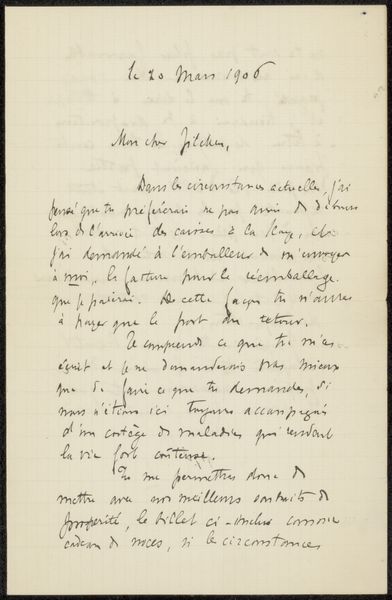
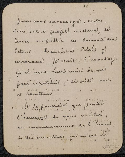
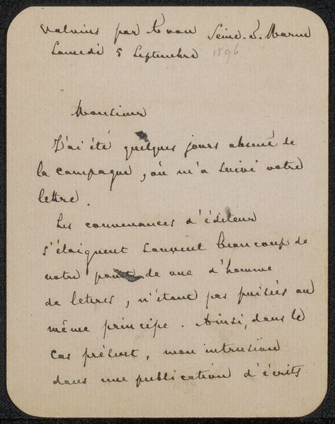
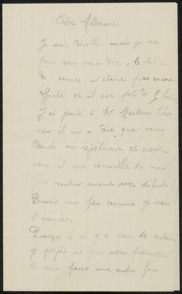
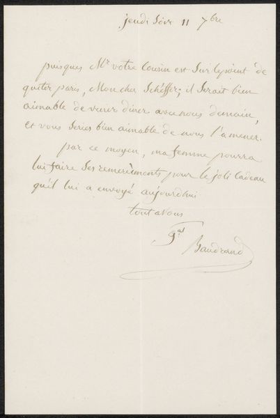
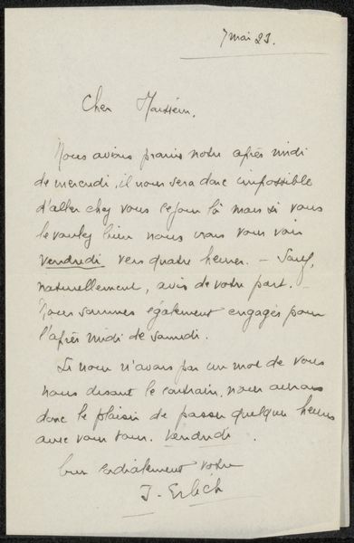
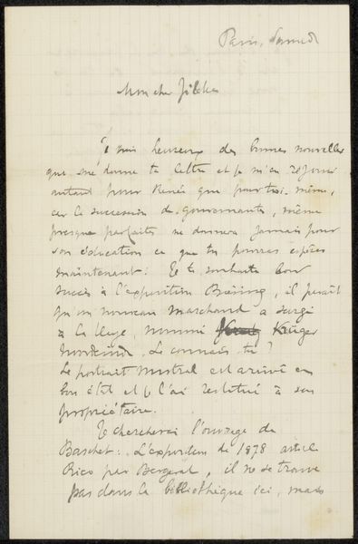
Editor: This is "Brief aan Philip Zilcken," thought to be written sometime between 1893 and 1899 by Emile Zola. It's an ink drawing on paper, and what strikes me immediately is the controlled chaos of the script. It's so dense and full, yet clearly ordered. What elements of the letter's form and visual texture stand out to you? Curator: The calligraphic qualities of the writing are, indeed, quite prominent. Consider the interplay of positive and negative space. The dense clusters of text are offset by the creamy expanse of the paper, creating a dynamic tension. Notice also the variations in line weight. The thick downstrokes contrast sharply with the delicate hairlines, adding to the visual complexity. The ink itself, its tonality, establishes a deliberate contrast against the fibers of the page. Do you agree? Editor: Yes, I agree, that contrast is key. It feels intentional. Could that contrast also suggest something about Zola’s state of mind or intentions in writing? Curator: We can observe within this letter a formal analogue for thought: its ebbs and flows and subtle modulations. It’s more important to analyze the structural relationships within the work itself, the ways the composition generates meaning independently. It's an interesting thing to see words visually become art here in the shapes of handwriting on this physical piece of paper, wouldn’t you say? Editor: That makes sense. I can appreciate how focusing on those purely visual relationships gives me a new appreciation for the piece. I see that this goes beyond just being a letter, in terms of artful quality. Curator: Precisely. The structural arrangement of these graphemes and lines is all-important. In other words, consider only the artwork that is immediately evident; all external context becomes less crucial.
Comments
No comments
Be the first to comment and join the conversation on the ultimate creative platform.
More like this