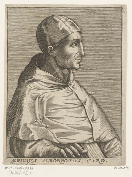
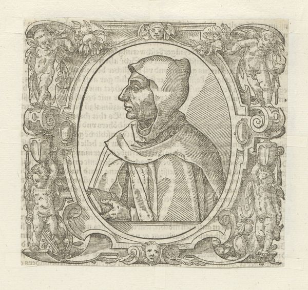
engraving
portrait
baroque
old engraving style
line
history-painting
engraving
realism
Dimensions: height 134 mm, width 92 mm
Copyright: Rijks Museum: Open Domain
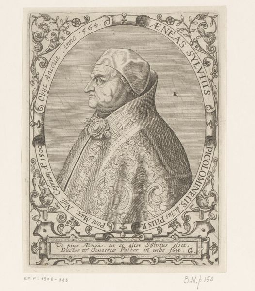
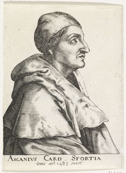
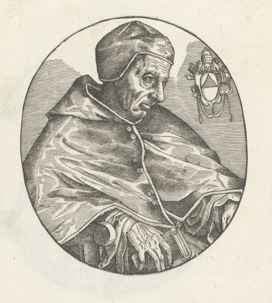
Curator: The Rijksmuseum houses an intriguing 17th-century engraving, a "Portret van kardinaal Gil Álvarez Carrillo de Albornoz" by an anonymous artist. What catches your eye first? Editor: The line work is immediately striking. It feels incredibly detailed, but stark—a lot of clear delineation that gives it a rather somber and formal feel. You can really see the hand of the engraver at work. Curator: Indeed. The composition is rather direct, adhering to portrait conventions with the cardinal presented in profile. Note the artist's strategic deployment of line density. This helps create shadow, volume, and a sense of gravitas. Editor: Right, you can almost feel the weight of the fabric in his robes. It's amazing how the engraver translated texture, and presumably, the value of that material into these precise etched lines. Was the material part of the social statement here, in the making of this work? Curator: Possibly. The linear style contributes to the artwork’s realist execution. The subject's expression remains neutral, inviting the viewer to interpret the meaning. The clean lines almost lend it a timeless quality. The austerity here speaks volumes. Editor: Austerity certainly makes its statement through material constraints here, using engraving—with those explicit marks—versus a brushstroke—but it also is intriguing as to why the labor was applied here. Engravings such as this likely served as disseminations of status and religious hierarchy. Think about the consumption that these portraits aided in the 17th century. Curator: That’s a fascinating point—how these portraits were distributed and consumed—amplifying Cardinal Albornoz’s influence through material reproduction. The artist certainly chose a precise, reproducible medium well. Editor: Overall, the printmaking seems less about artistic flair, and more a functional medium within complex historical forces. Curator: It is certainly difficult not to view it in the historical context. It's truly a study in contrasts. Editor: Yes, examining the material reveals far more than just aesthetics.
Comments
No comments
Be the first to comment and join the conversation on the ultimate creative platform.