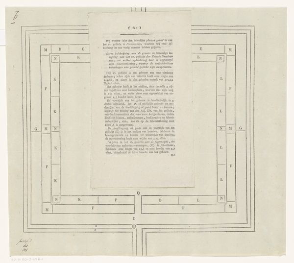
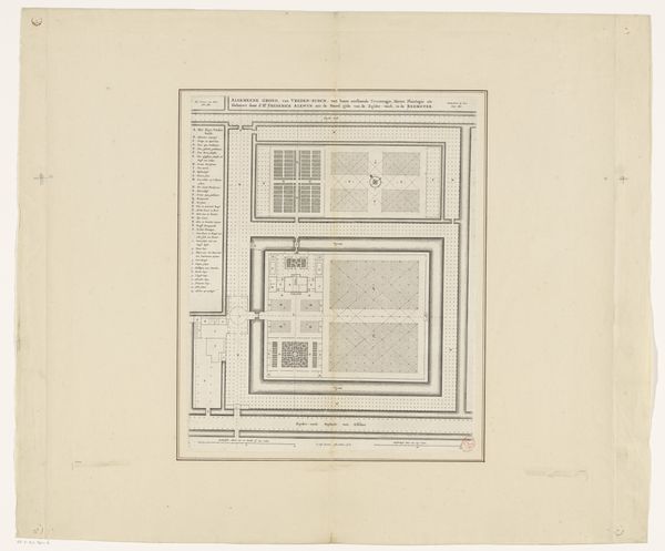
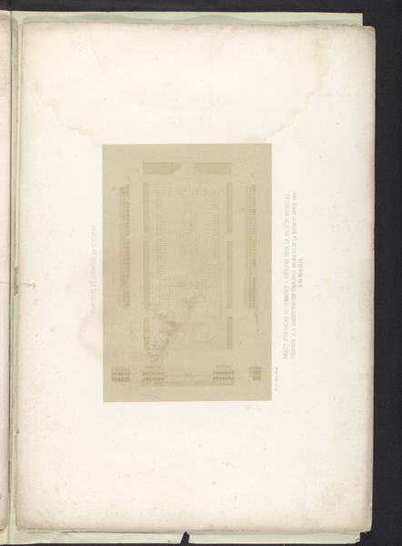
Plattegrond en beschrijving van het derde gesticht van de Maatschappij van Weldadigheid te Veenhuizen 1827
0:00
0:00
drawing, graphic-art, print, paper, engraving
#
drawing
#
graphic-art
# print
#
paper
#
engraving
Dimensions: height 324 mm, width 342 mm
Copyright: Rijks Museum: Open Domain
Curator: This graphic work before us is entitled "Plattegrond en beschrijving van het derde gesticht van de Maatschappij van Weldadigheid te Veenhuizen," dating back to 1827. The artist is Johannes van der Hey, rendered in print, engraving, and drawing on paper. Editor: My initial impression is one of order…almost sterile in its precision. It's a blueprint, really. It evokes this strange sense of control and almost... coldness. Curator: Indeed. It’s a plan – a highly structured diagram, a bird's-eye view revealing its geometrical framework and interior divisions. We can appreciate the use of line, form, and text to denote functions. The careful arrangement suggests hierarchy and order. Note the repeated shapes and their regimented disposition within the overall structure. Editor: It does give a clinical feel. Thinking about it more, the societal implications feel unsettling. The artist here captures something not just about a building but about the society’s vision for the 'undeserving,' laid out like this... Curator: You touch on something crucial. As an aesthetic object, it operates on its visual construction; how form and line intersect to produce meaning and convey ideology. Consider its almost uncanny flatness and lack of visual depth; this may imply a singular perspective, a controlling gaze. Editor: Absolutely, and the medium itself reinforces this sense. Engravings, prints… they allow for duplication, distribution. It reinforces the systematic organization on display and implies an even larger system at work here. And knowing what these buildings were, how they functioned...it feels a little disturbing. Curator: Agreed. What does this graphic representation seek to emphasize or conceal? Consider this as an exercise in ideological formatting, rather than objective documentation. Editor: Well, thinking of it in terms of ideological format makes this feel really powerful, unsettlingly so. A chilling look behind the veneer of 'welfare'. Curator: Indeed. A stark and powerful piece of visual architecture!
Comments
No comments
Be the first to comment and join the conversation on the ultimate creative platform.
More like this