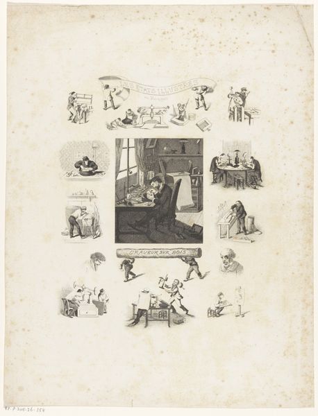
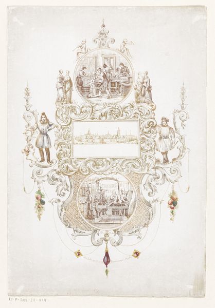
Ziet, kindren! ydre maan van 't jaar, / Door tekening en snykunst pralen (...) 1791 - 1812
0:00
0:00
print, engraving
# print
#
old engraving style
#
genre-painting
#
northern-renaissance
#
engraving
Dimensions: height 405 mm, width 320 mm
Copyright: Rijks Museum: Open Domain
Editor: This print, “Ziet, kindren! ydre maan van 't jaar...” by Johannes Egbertus van Lieshout, made between 1791 and 1812, uses engraving to illustrate the months. It has a storybook feel; it’s both whimsical and orderly in its arrangement of scenes. How do you interpret this work based on its visual structure? Curator: Looking at this engraving, my attention is drawn to how Lieshout constructs meaning through visual relationships. Observe the symmetrical arrangement of the ovals, mimicking a cyclical understanding of time, further emphasized by the central ribbon and floral elements which binds each scene. How does this visual framing affect the narrative being presented? Editor: It seems to create a sense of the natural progression of time, but in a very structured, almost decorative way, contrasting nature with human-made order. What about the use of line and the limited color palette? Curator: The graphic clarity of the engraved lines provides a framework, lending structure and order to the pictorial schema. The monochrome emphasizes the cyclical nature of the seasons, each framed miniature adding to the structure as a whole. Do you see any instances where line is more heavily used to convey depth or shadow, guiding the viewer’s gaze? Editor: I see the heavier lines defining the figures in the "November" and "December" scenes, which seem to bring those elements forward, creating a more dimensional feel, while other scenes have thinner, flatter lines. It’s like there is a hierarchy in focus based on line weight, almost creating another narrative. Curator: Precisely! And observe how Lieshout uses variations in line density not merely to depict shadow, but also to underscore the symbolic weight each month holds within the overall visual calendar. This print demonstrates how formal elements become crucial components in the work’s symbolic vocabulary. Editor: It's fascinating to see how focusing on the structure and technique unveils so many layers of meaning, especially when each part contributes to the narrative whole. Curator: Indeed, by examining these visual devices, we begin to decode Lieshout's structuralist engagement with temporality itself.
Comments
No comments
Be the first to comment and join the conversation on the ultimate creative platform.
More like this