Copyright: CC0 1.0
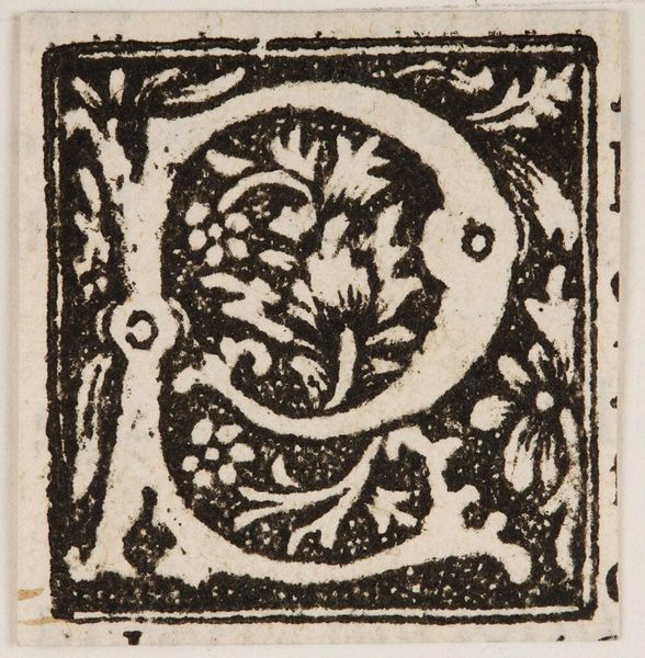
Editor: Here we have "Letter Q," an undated print by an anonymous artist. The stark black and white and dense floral pattern create an interesting contrast. What do you see in this piece from a formalist perspective? Curator: The composition emphasizes symmetry and balance. Note the strategic use of negative space; it shapes the floral motifs, contributing to the overall visual rhythm. What role do you think the limited tonal range plays? Editor: I think the contrast heightens the formal structure, making it more impactful. I appreciate how your analysis isolates these key features. Thanks! Curator: Indeed. The relationship between form and content reveals how the anonymous artist uses stark contrasts to focus attention on structural elements and their arrangement.
Comments
No comments
Be the first to comment and join the conversation on the ultimate creative platform.
More like this