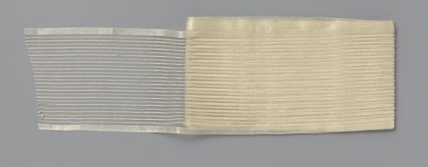
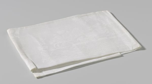
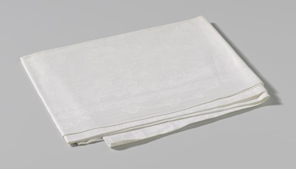
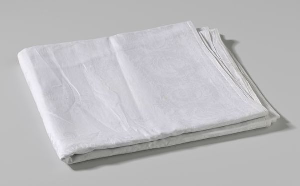
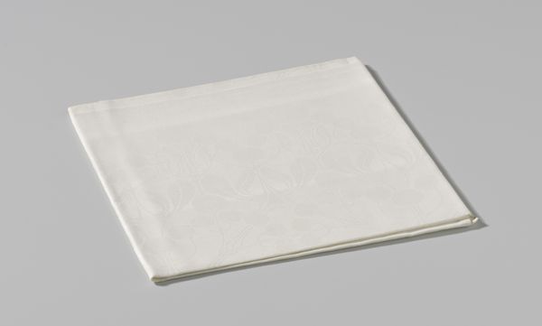
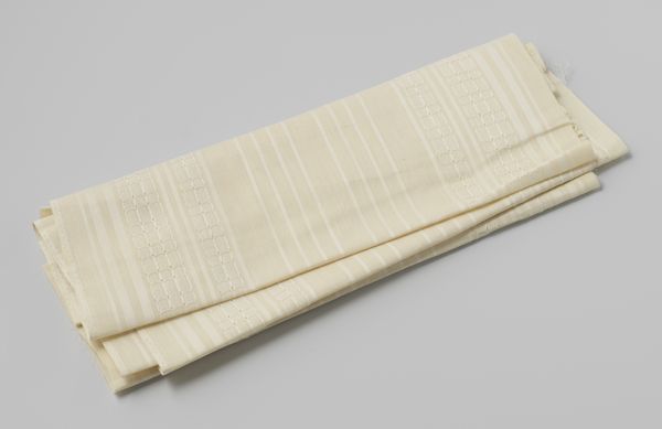
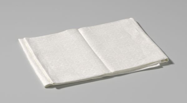
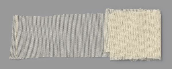
Dik papier waarop crème-wit lint van zijden gaas met ingeweven zigzagpatroon c. 1900
0:00
0:00
gustavschnitzler
Rijksmuseum
silk, weaving, textile
#
silk
#
fashion mockup
#
weaving
#
textile
#
fashion based
#
product design photgrpaphy
#
wearable design
#
designed for kid
#
clothing photo
#
decorative-art
#
fashion sketch
#
design on paper
#
printed materiality
#
clothing design
Dimensions: width 12 cm, length 23.5 cm, width 14.5 cm
Copyright: Rijks Museum: Open Domain
Editor: This is a length of 'Dik papier waarop cr\u00e8me-wit lint van zijden gaas met ingeweven zigzagpatroon,' or 'Thick Paper with Cream-White Silk Gauze Ribbon with Woven Zigzag Pattern' by Gustav Schnitzler, dating from around 1900. It's striking how the material, this delicate silk, creates such a strong geometric pattern. What is your read of this piece from a formal perspective? Curator: A compelling query. Focusing on form, one is immediately struck by the interplay between the rigidity of the woven zigzag and the sheer fragility of the silk gauze itself. Observe the subtle shifts in tonality, from the opaque density of the tightly wound roll to the airy lightness where the ribbon unfurls. Does the juxtaposition of these textures and densities evoke a particular reading for you? Editor: It's like seeing structure and deconstruction at the same time. The regular, geometric pattern implies order, but the delicate, almost ethereal quality of the silk hints at fragility and impermanence. What significance would you attribute to the use of a zigzag pattern here? Curator: The zigzag is inherently dynamic, a visual articulation of movement and direction. It disrupts the static nature one might expect from such a restrained color palette and material. The semiotics of the zigzag could be seen as representative of progress, or perhaps even a subtle tension between the decorative arts and industrial design of the era. Are you finding the composition symmetrical or asymmetrical and what is the effect of the design, the paper label for instance? Editor: I see what you mean. The layering of textures, from the coarse paper to the silky threads, really brings the piece alive. It makes me appreciate the careful crafting of each element. Curator: Indeed, and by observing those integral elements the formal structure elevates a simple textile into something far more stimulating than the sum of its parts. I found this rather enlightening myself, looking at the weave, as you pointed out. Thank you!
Comments
No comments
Be the first to comment and join the conversation on the ultimate creative platform.
More like this