drawing, print, paper
#
drawing
# print
#
paper
Copyright: Rijks Museum: Open Domain
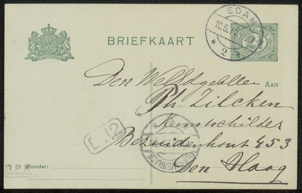
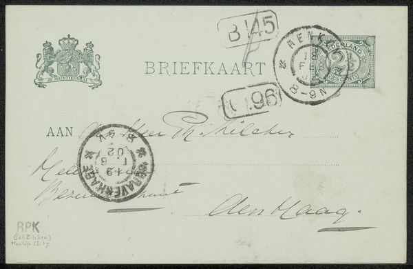
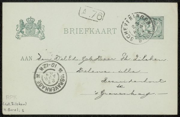
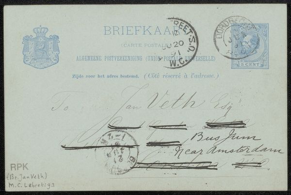
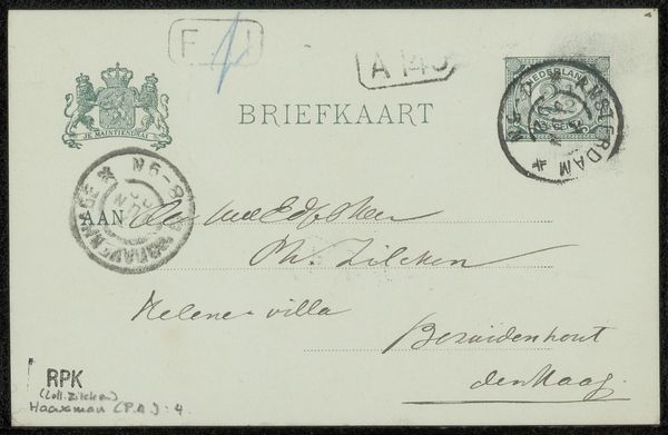
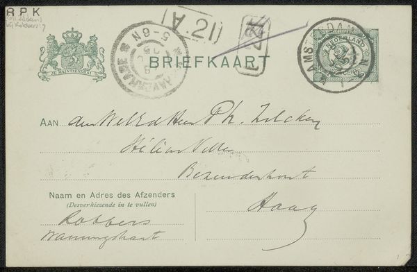
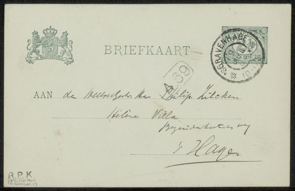
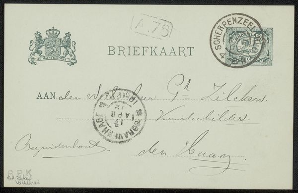
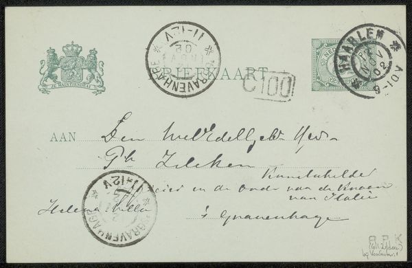
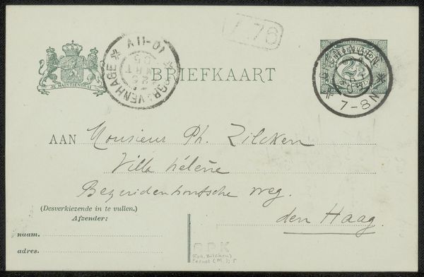
Editor: This is "Briefkaart aan Philip Zilcken," or "Postcard to Philip Zilcken," thought to be from 1906, by Anton L. Koster. It seems to be a drawing reproduced as a print on paper. It's visually quite busy with handwritten text, stamps, and seals. What elements stand out to you most in this work? Curator: Immediately, the structural tension between the rigidity of the pre-printed postcard layout and the expressive freedom of the handwriting compels attention. The deliberate placement of each stamp, seal and address contributes to an interplay between formal design and personalized communication. Note the density of visual elements and how the eye struggles for focus – it's a calculated field of visual energy. Editor: I hadn't considered it that way; I was more drawn to the somewhat faded quality of the inks. Does the aging of the paper or ink impact your formalist reading at all? Curator: Intriguingly, the degradation becomes integral to the form. It introduces an element of chance and decay. The blurred seals and faded writing introduce indeterminacy to the composition. What once might have been pristine now exists in a state of constant flux, becoming both a historical record and a meditation on ephemerality. Editor: That's a perspective I hadn't fully considered. The idea of deterioration adding to the artwork’s essence is fascinating. Curator: Indeed, and by considering it from a purely structural standpoint, one begins to understand the work on a deeper, almost philosophical, level. It makes you wonder, doesn't it? Editor: Absolutely. It's like seeing the artwork not just as an object but as an evolving system.
Comments
No comments
Be the first to comment and join the conversation on the ultimate creative platform.
More like this