paper, ink, pen
#
hand-lettering
#
old engraving style
#
hand drawn type
#
paper
#
personal sketchbook
#
ink
#
hand-drawn typeface
#
ink drawing experimentation
#
pen-ink sketch
#
pen work
#
sketchbook drawing
#
pen
#
sketchbook art
#
calligraphy
Copyright: Rijks Museum: Open Domain
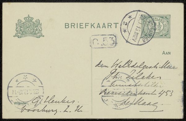
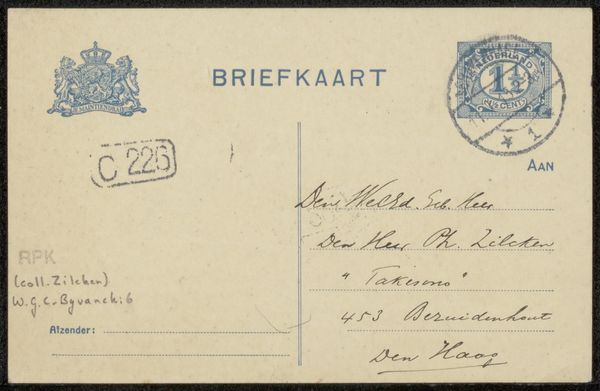
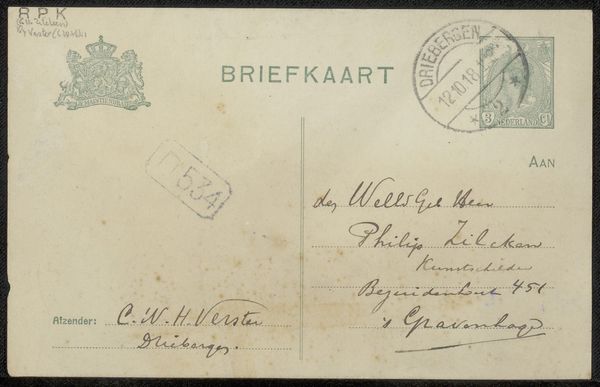
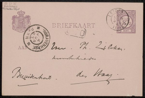
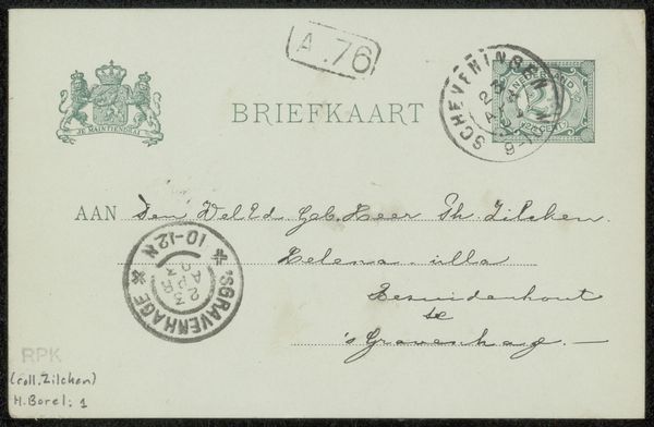
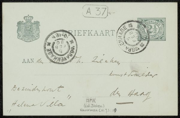
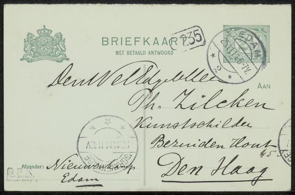
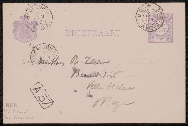
Editor: This is "Briefkaart aan Philip Zilcken" – a postcard to Philip Zilcken, created before 1916 by Gerke Henkes. It's ink on paper and currently held at the Rijksmuseum. It’s fascinating how Henkes used handwritten text almost as the main subject of the artwork itself, not just as a message. What are your thoughts on it? Curator: It is interesting to observe how the artist employs calligraphic elements beyond mere communication. Note the deliberate arrangement of the text; it occupies a significant portion of the picture plane. The weight of the pen strokes, the varying densities of ink, create a visual rhythm. Are you noticing the formal relationship between the address and the printed word "Briefkaart"? Editor: Yes, now that you point it out, there's a conscious layering and contrasting of the handwritten address with the printed elements. The sender's address at the lower left and the receiver's address to the right, act as graphic blocks anchoring the central field of information. Curator: Precisely. Consider the structural integrity achieved through this seemingly casual composition. Each element contributes to a unified whole, reinforcing the intrinsic visual language of the artwork. The stamps further disrupt the flatness. Are they merely functional? Or do they integrate into the artistic framework? Editor: I initially perceived the stamps as practical necessities. But the careful placement certainly adds a graphic quality to the composition. Perhaps it elevates a common piece of mail into something… more considered. I see what you mean about formal relationships now, thinking about texture, density, the shapes. Curator: Indeed. Focusing on these fundamental visual components opens avenues for interpretation, moving past the purely textual or functional aspects. The work achieves visual harmony through the considered interplay of script, stamps and even the crest to the top-left. Editor: I hadn't considered the formal elements so directly. It is less about "what does this mean" and more about "what do I see" which then informs a deeper meaning. Curator: Exactly, and that focus unlocks the deeper qualities embedded within the artist’s intentional framework.
Comments
No comments
Be the first to comment and join the conversation on the ultimate creative platform.
More like this