drawing, paper, ink, pen
#
drawing
#
hand-lettering
#
hand drawn type
#
hand lettering
#
paper
#
personal sketchbook
#
ink
#
hand-drawn typeface
#
ink drawing experimentation
#
intimism
#
pen-ink sketch
#
pen work
#
sketchbook drawing
#
pen
#
sketchbook art
Copyright: Rijks Museum: Open Domain
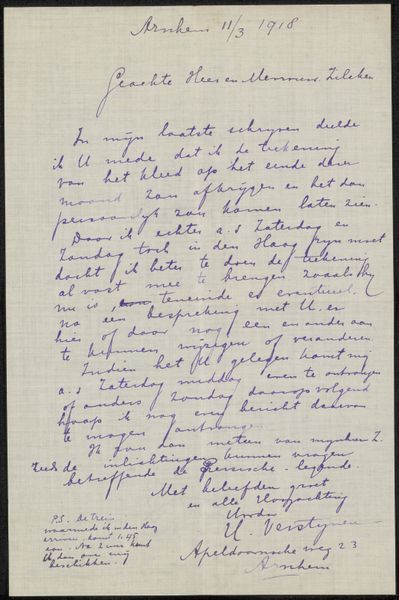
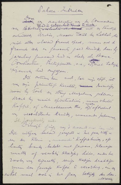
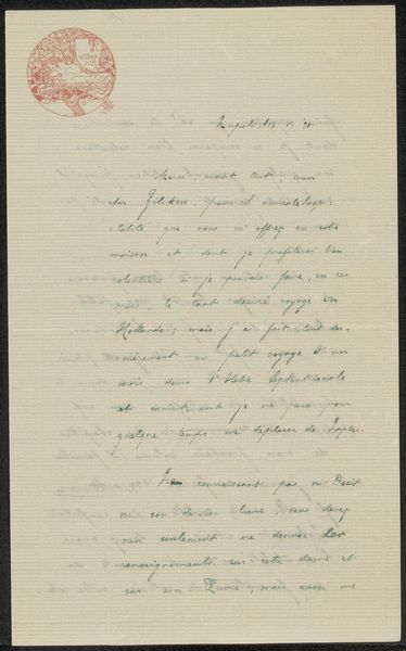
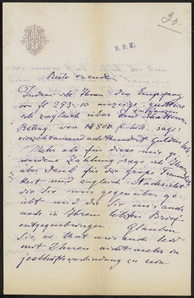
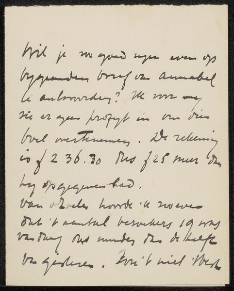
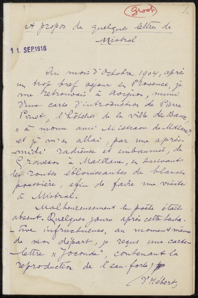
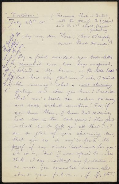
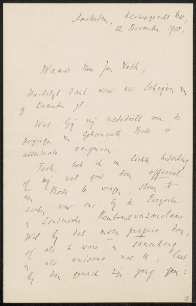
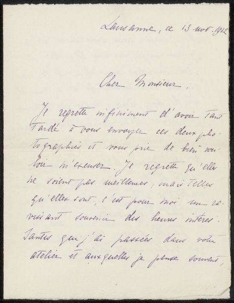
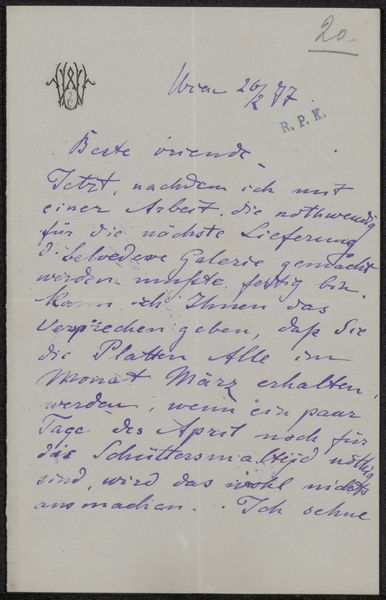
Editor: This is “Brief aan N.J. Singels,” possibly from 1913, by Philip Zilcken, now at the Rijksmuseum. It’s an ink drawing on paper, and, well, it’s a letter! A handwritten letter. There’s something so intimate about seeing someone’s handwriting. What do you make of it? Curator: Oh, I find it completely charming! Imagine holding that letter, feeling the texture of the paper Zilcken touched. For me, this isn’t just a note, it’s a portal. The slant of his script, the way he forms his 's'—it hints at his personality, doesn’t it? It makes you wonder, who was N.J. Singels, and what was their relationship like? A fellow artist perhaps? I can almost imagine Zilcken dipping his pen in ink, a little distracted, perhaps thinking about what to say, the very air of his studio hanging about him… Editor: It's true; the act of writing itself becomes part of the artwork. It reminds me of a sketchbook – personal, exploratory… almost like visual thinking. Do you think that informs how we should look at it? Curator: Precisely! A letter like this walks the line between functional communication and art object, and perhaps even reveals some intersection of daily life and aesthetic reflection for Zilcken. I wonder, what part of the text draws your eye most? Does a specific word, or even a letterform catch your attention? Editor: It’s the little flourish under “Singels,” and how ‘feb’ is abbreviated to ‘feb.’… It feels so casual. Curator: Yes, it’s a peek behind the curtain. It is little details that render “Brief aan N.J. Singels” unexpectedly engaging. We project our narrative, weaving imagination and interpretation. Thank you. Editor: Absolutely! Thank you! I’ll never look at handwriting the same way.
Comments
No comments
Be the first to comment and join the conversation on the ultimate creative platform.
More like this