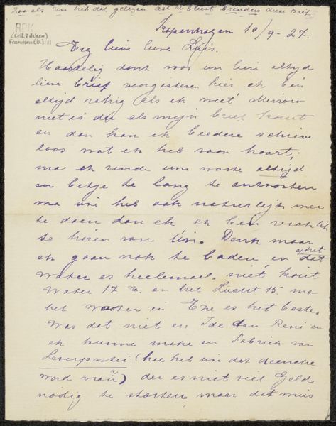
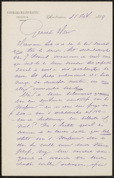
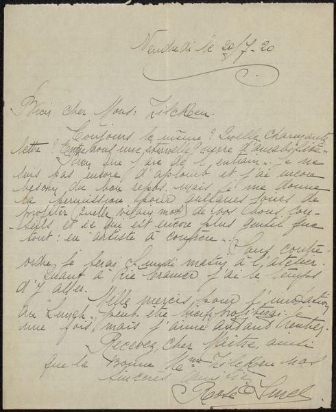
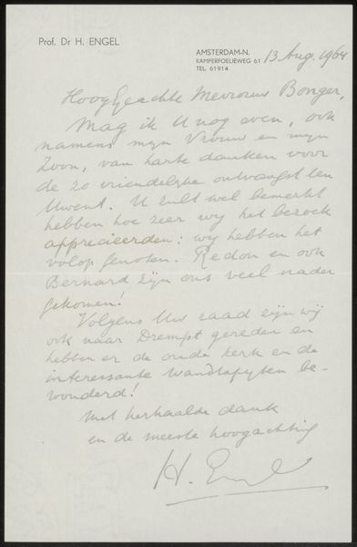
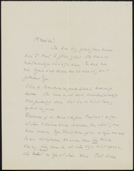
drawing, paper, ink
#
portrait
#
drawing
#
paper
#
personal sketchbook
#
ink
#
calligraphy
Copyright: Rijks Museum: Open Domain
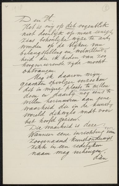
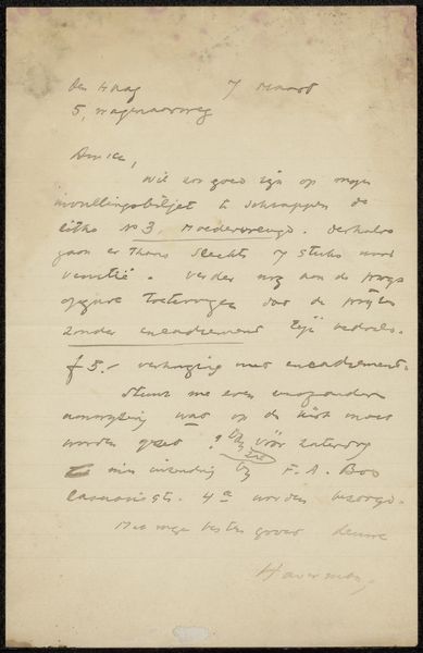
Editor: This is "Brief aan Jan Veth," or "Letter to Jan Veth," by Richard Nicolaüs Roland Holst, created sometime between 1878 and 1925. It’s an ink drawing on paper, currently housed in the Rijksmuseum. The first thing that strikes me is the beauty of the handwriting itself; the texture seems incredibly important here. What catches your eye about it? Curator: The calligraphic element certainly dominates. Observe how the density of the ink, modulated through varying pressure, constructs the formal characteristics. Line becomes mass, shaping both letter and page. What does the arrangement of text on the page evoke for you? Editor: It feels very personal and intimate, not meant for public display, more like something from a personal sketchbook, perhaps? The handwritten nature makes me wonder about the message contained in the lines. Curator: Consider the formal properties rather than narrative content. The contrast between the dense lines of the text and the negative space of the paper is particularly compelling. This stark contrast creates a dynamic visual tension, no? It activates the surface, prompting the eye to move across the entirety of the work. What function might that whitespace be serving here, do you think? Editor: Maybe it’s balancing out the heavy inking, giving the eye somewhere to rest amidst all that text. The whitespace is doing so much of the heavy lifting. Curator: Precisely. Note also the rhythm established by the consistent slant of the handwriting. This regularized structure lends a sense of order and balance, working in concert with—or perhaps even against—the implied informality of a personal letter. We might even examine the relationship of verticals and horizontals here... Editor: So, even something as seemingly straightforward as a letter reveals a sophisticated interplay of formal elements. It highlights how critical the execution is regardless of intention. Curator: Indeed. By observing these basic aspects, we unveil the aesthetic intent. Close attention to those intrinsic qualities really illuminates the artwork’s visual syntax.
Comments
No comments
Be the first to comment and join the conversation on the ultimate creative platform.
More like this