drawing, ink, pencil
#
drawing
#
baroque
#
ink
#
geometric
#
pencil
Dimensions: height 174 mm, width 75 mm
Copyright: Rijks Museum: Open Domain
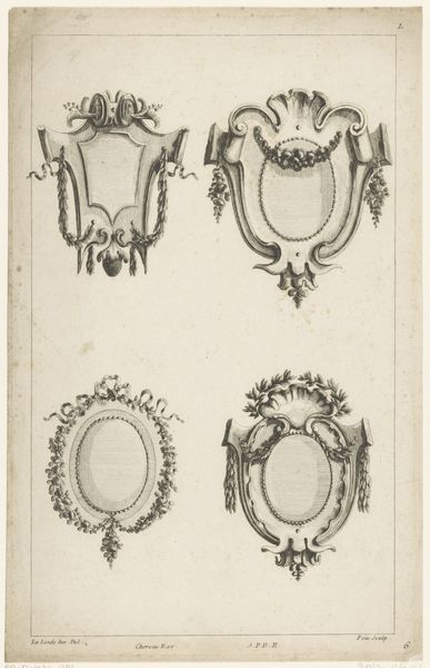
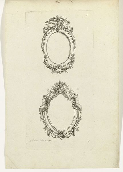
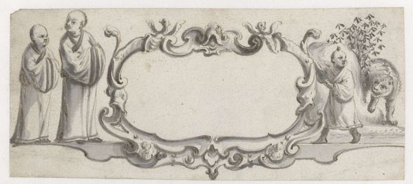
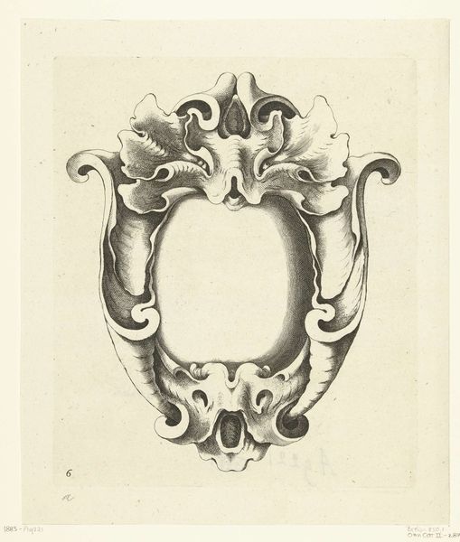
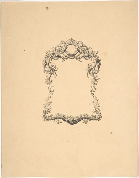
Curator: This intriguing sketch, "A Large and Four Small Oval Cartouches," was rendered between 1630 and 1672, crafted with pencil and ink. Pieter Jansz is credited as its creator. Editor: My first impression is that of baroque frivolity. There is such playfulness in these delicate cartouches—they feel buoyant, almost weightless, like they could float away. Curator: Indeed! Consider the elegant structure. The eye moves from the commanding oval cartouche at the apex, down to the meticulously mirrored arrangements below, all anchored by those precisely rendered, though somewhat melancholic, geometric forms. Editor: Melancholic because while symmetry and ornamentation are indeed on display, they appear divorced from actual utility. Are we meant to infer something about the nature of wealth, adornment, and display in the period it was created? Where would these cartouches hang and for whom? Curator: Precisely! The date positions it squarely within the Baroque era, a time of shifting powers. Note the emphasis on curves and ornamentation—a deliberate move away from Renaissance classicism, suggesting a period embracing grandeur, detail, and even a degree of artifice. The eye is encouraged to linger on surface and form, a deliberate play with perception. Editor: Given the Baroque emphasis on grandeur and given the context of European colonialism at that time, can we assume Jansz was interested in wealth and display, or potentially interested in the effects of imperial trade on identity formation for his wealthy clients? The bows adorning the smaller cartouches look almost as if they could morph into nooses…a morbid element I wonder whether it’s worth noting given its context? Curator: While compelling, I caution against such a direct interpretation. Instead, let us appreciate the artist’s mastery of line and form. The interplay of light and shadow creates a three-dimensionality, drawing our eye into the blank cartouches themselves. Note that the central, larger cartouche dwarfs those beneath, a deliberate act that directs our gaze upwards to reflect on divine glory. Editor: Or perhaps a visual reminder of entrenched social hierarchies within society, where access to "divine glory" and status depends on family and access? But to come back to the artwork's form—these frames remind me of Dutch society and global commerce more generally. Both offered a facade of structure and decoration that held far more insidious systems in place. Curator: In its purest form, Jansz’s study presents an unparalleled study in shape and space, an eloquent design. Editor: But those forms never exist in a vacuum, right? Ultimately, it’s Jansz’s historical position, not merely these geometries on the page, that pique my curiosity.
Comments
No comments
Be the first to comment and join the conversation on the ultimate creative platform.
More like this