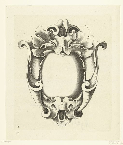
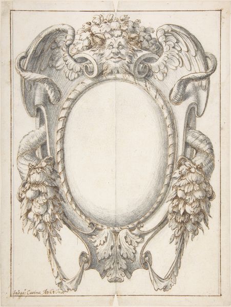
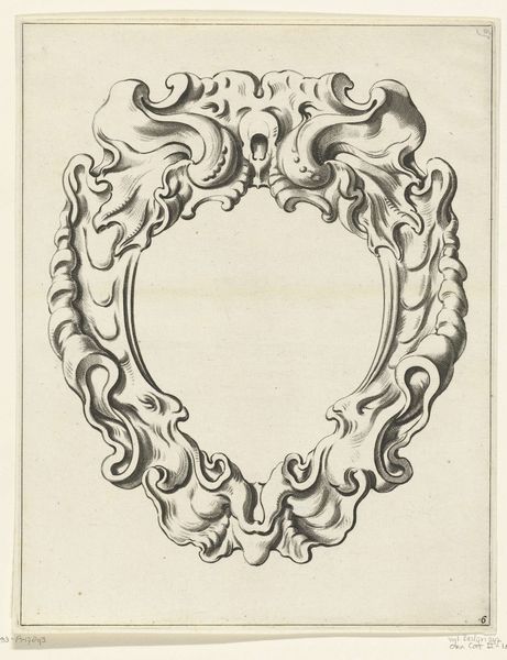
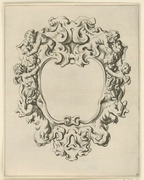
Kwabornament: voor het titelblad Figures à la mode dedidiées à M. le Duc de Bourgogne 1685
0:00
0:00
sebastienleclerci
Rijksmuseum
drawing, print, engraving
#
drawing
#
baroque
# print
#
form
#
line
#
decorative-art
#
engraving
#
calligraphy
Dimensions: height 149 mm, width 97 mm
Copyright: Rijks Museum: Open Domain
Curator: The Rijksmuseum holds this engraving and drawing in its collection. It's entitled "Kwabornament: voor het titelblad Figures à la mode dediées à M. le Duc de Bourgogne," created around 1685 by Sébastien Leclerc I. Editor: At first glance, it seems a rather unsettling ornamental design. The grotesqueries are meant to be attractive? The symmetry of the work does invite you in to the work but it does feel slightly oppressive in terms of the mask. Curator: Indeed. Its structure exemplifies Baroque sensibilities, pushing formal boundaries while adhering to a structured line and shape. Consider how the calligraphic line and the interplay of concave and convex forms creates a visual dance for the eye. Note how the artist manipulates light and shadow within these linear contours, lending depth to what is inherently a two-dimensional plane. Editor: Precisely! The face you noticed at the top of the crest looks like a type of guardian or perhaps a warning, doesn't it? Its symbolism and integration with vegetal forms seems almost primal. The design echoes familiar Baroque love of ornament. The way forms build upon each other is so heavy, like psychic weight of that period coming into full form in ornament. Curator: I concur. And while we can read a variety of meanings and emotions into these shapes, we cannot avoid that its beauty stems directly from those perfect proportional relationships. We read its form as something knowable, as something solid. The structural balance is striking. Editor: I do see the order imposed. But isn’t the power of such an image about both the order and the way its symbolism communicates deep ancestral ideas? It evokes a complex world with one clear impression—the period from which this was borne was no doubt complex. Curator: Quite so, to distill a cultural moment to a design on paper… We’ve peeled back interesting layers, I think. Editor: Agreed. This was more than an exercise in pure form, or simple recreation of common iconographies from the time—this work echoes deep with cultural identity and its symbolic weight.
Comments
No comments
Be the first to comment and join the conversation on the ultimate creative platform.
More like this