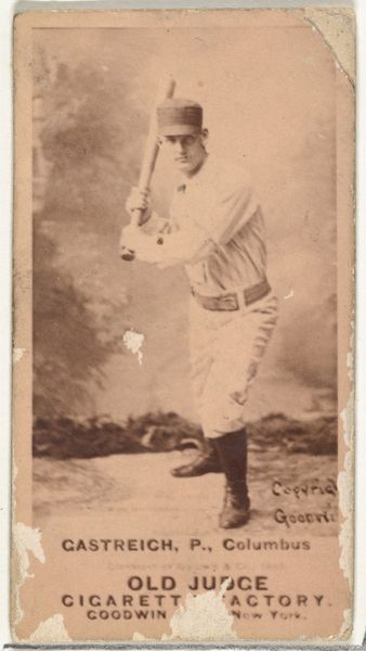
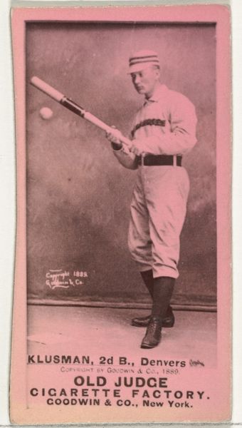
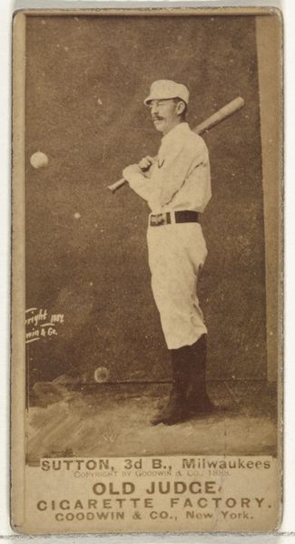
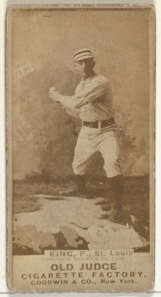
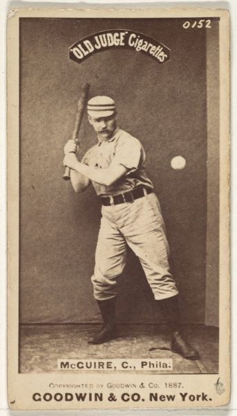
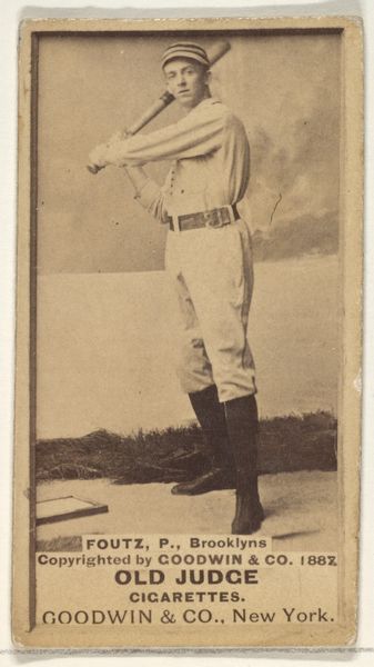
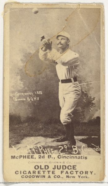
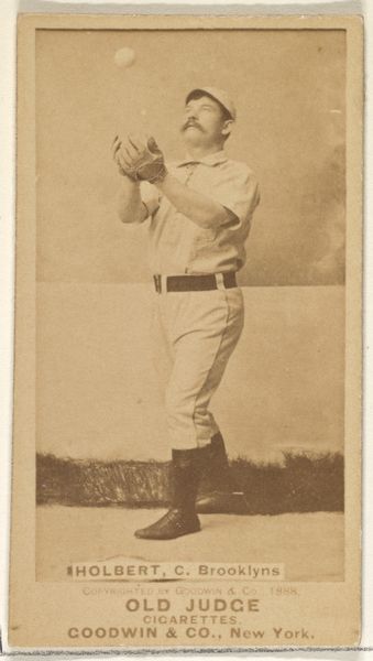
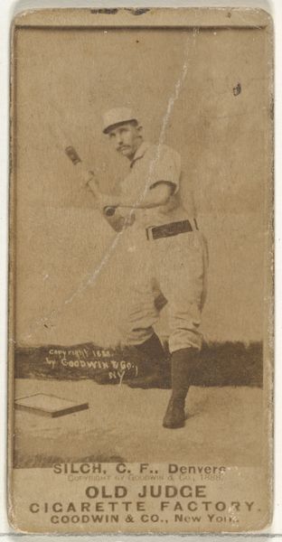
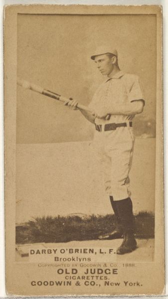
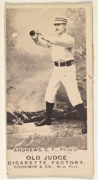
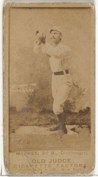
Baseball Fielder, from the Games and Sports series (N165) for Old Judge Cigarettes 1889
0:00
0:00
drawing, coloured-pencil, print
#
portrait
#
drawing
#
coloured-pencil
# print
#
impressionism
#
baseball
#
coloured pencil
#
men
#
genre-painting
Dimensions: sheet: 1 1/2 x 2 3/4 in. (3.8 x 7 cm)
Copyright: Public Domain
Curator: This is a baseball card, titled "Baseball Fielder," which comes from the "Games and Sports" series (N165) made in 1889 by Goodwin & Company. The artwork is rendered with coloured pencil on print, and it now resides at the Metropolitan Museum of Art. Editor: Immediately I am drawn to the contrast—the sharp portrait on the left against the hazy action scene on the right. The whole thing has this gentle, dreamlike quality, almost as if remembering a perfect summer day from childhood. Curator: What interests me is the convergence of consumer culture and art. These cards, given away with Old Judge Cigarettes, used a labor-intensive colour pencil printing process to elevate what was essentially an advertisement to an aesthetic object. It’s a really interesting move from function to something viewed as fine art, or collectible, at least. Editor: Yes, there’s a charm in these being tied to everyday ephemera. A piece of chewing gum and suddenly there's fine art in the middle, stuck to it. That tension is very much apparent, a way to give value through visual refinement when its value ultimately resides in product placement. Do you think baseball being linked to Tobacco does anything else? Is it just commercial appeal? Curator: I suspect the association reflects a cultural moment too, a very active era where sports became a signifier of leisure and upward social mobility—paired, obviously, with the accessibility of something like cigarettes for widespread distribution. The portraits gave buyers, usually men, figures to align themselves with. Editor: It’s a tiny, poignant piece, but feels as though something significant is going on with colour in the print itself. It looks…muted… almost dusty. Does the method play into this faded sensibility at all? Curator: Absolutely. The choice of coloured pencil, which is somewhat unusual for printed cards, contributes to the artwork’s distinct aesthetic. The subtle gradations and soft textures created by the coloured pencils create a tactile impression, setting it apart from standard photography of that time and allowing a softer and less harsh reading. Editor: Considering this dialogue, I now see how much detail can emerge, like the layered understanding and perspective itself being built like colour being laid upon pencil. Curator: I agree, noticing that confluence, of what's advertised as value versus material process creates a rich dialogue and understanding in unexpected ways.
Comments
No comments
Be the first to comment and join the conversation on the ultimate creative platform.
More like this