drawing, paper, ink
#
drawing
#
hand written
#
script typography
#
hand-lettering
#
ink paper printed
#
hand drawn type
#
hand lettering
#
paper
#
ink
#
hand-written
#
hand-drawn typeface
#
fading type
#
thick font
#
monochrome
Copyright: Rijks Museum: Open Domain
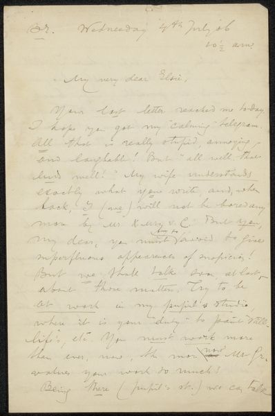
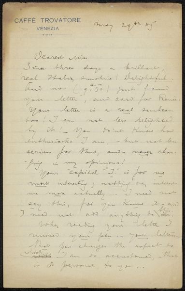
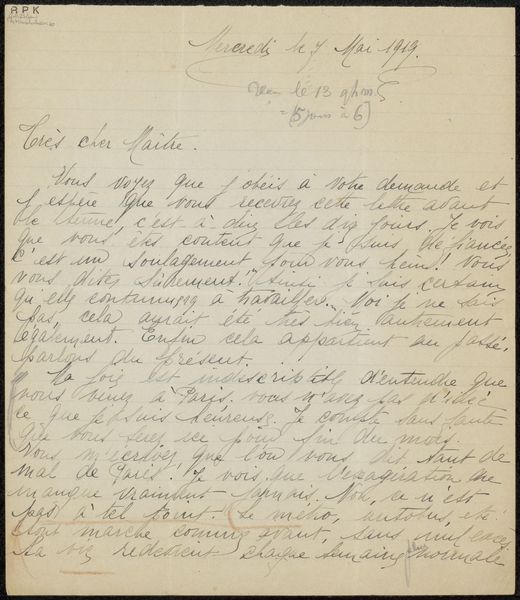
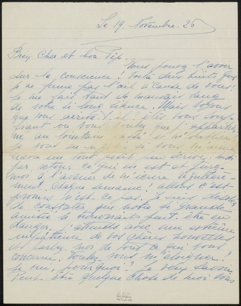
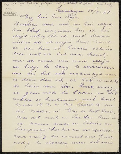
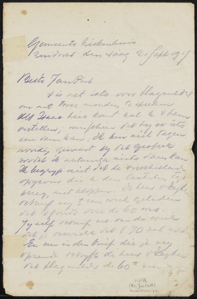
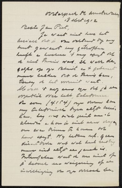
Curator: We're looking at "Brief aan Jan Veth," a drawing, probably from 1916, by Wally Moes. It's a letter, handwritten in ink on paper. Editor: It has a delicate, almost spectral quality, doesn't it? The ink seems faded, giving the words a ghostlike presence on the page. Curator: Indeed. Moes was known for her involvement in social causes, and her letters often reflect her deeply held beliefs and engagement with the intellectual circles of her time. This letter addressed to Jan Veth provides insights into their relationship. Editor: The handwriting itself is striking. Notice how the thick font suggests a forceful personality, yet the fading ink introduces a layer of vulnerability, visually echoing themes of impermanence and memory. Curator: Exactly. Jan Veth was a prominent art critic, so Moes's choice to communicate through a carefully hand-lettered letter emphasizes the personal nature of their connection. Editor: The choice of monochrome adds to this timeless feeling, stripping away any distractions of color and compelling the viewer to focus on the pure forms of the letterforms and the composition of text upon the paper. The layout suggests a considered engagement, almost an intimacy, with the act of communication. Curator: Looking closely at the content, one gets the sense of a very personal appeal. The faded type also gives way to reflections of how societal upheavals might affect personal relations between those such as Veth and Moes. The overall work presents us a unique historical glimpse into a sensitive connection. Editor: It is an extremely evocative image that makes you reflect both about the context of the letter, but also how typography makes us understand art on an abstract yet emotional dimension. Curator: It’s been fascinating to consider how form and context work together in this singular piece, revealing intimate details about the life and connections surrounding Moes and her time. Editor: I completely agree. Close analysis of this letter provides a deeper understanding of how material choices contribute significantly to the overall emotional impact of art.
Comments
No comments
Be the first to comment and join the conversation on the ultimate creative platform.
More like this