drawing, paper, ink, pen
#
drawing
#
hand-lettering
#
dutch-golden-age
#
hand drawn type
#
hand lettering
#
paper
#
personal sketchbook
#
ink
#
hand-drawn typeface
#
ink drawing experimentation
#
intimism
#
pen-ink sketch
#
pen work
#
sketchbook drawing
#
pen
#
sketchbook art
Copyright: Rijks Museum: Open Domain
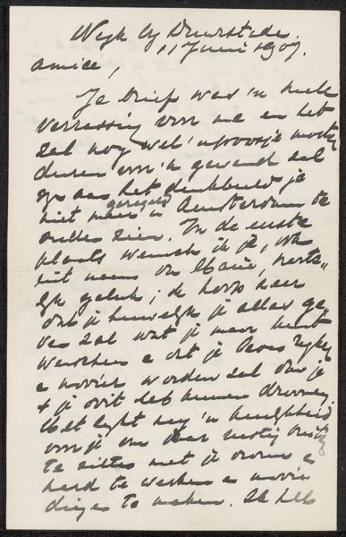
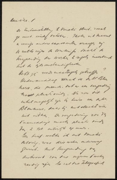
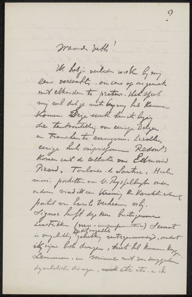
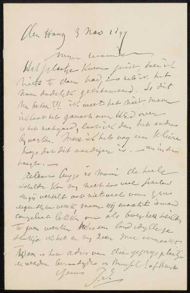
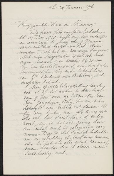
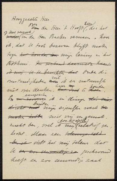
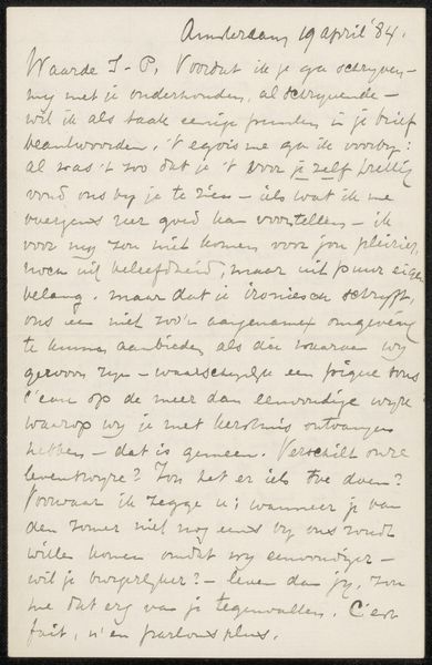
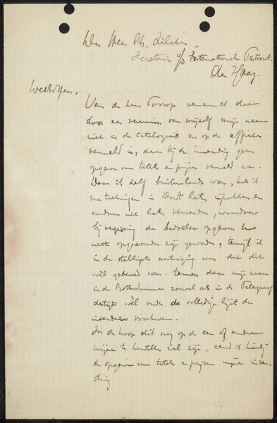
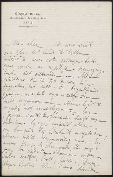
Curator: Here we have "Brief aan Jan Veth" or "Letter to Jan Veth", a pen and ink drawing on paper, possibly created between 1912 and 1918 by Willem Witsen. It resides at the Rijksmuseum. Editor: It looks very intimate, almost like catching a private thought. The casual script and the paper itself make it seem very immediate and unfiltered. It also seems that there are edits. Curator: Absolutely, and that immediacy is crucial. Witsen, known for his connections within Dutch artistic circles, wrote this personal letter in his characteristic hand. Considering the era, this level of correspondence highlights the network and material culture around artistic exchange. Editor: This is an unmediated form of dialogue between artists – think of the labor involved in manually writing this out. Do you get a sense, based on its materiality and tone, whether Witsen intended this letter only for Veth? Curator: Good point. The labor put into handwritten communication elevates the significance, yet its almost hasty style contrasts to traditional fine art presentation. Its placement at the Rijksmuseum allows a reflection on art history and artistic production during that time. Editor: It humanizes Witsen as more than an "artist genius." It invites us to consider their network. Jan Veth himself was very significant in the Dutch art scene and socialist politics! The exchange probably sheds light on both the men and the period. I wonder about access, and whether Veth’s labor and standing were equivalent to Witsen's. Curator: It emphasizes the value in art-making, the skill of handwriting, even amidst what feels casual. Appreciating the history and intent here opens discussion regarding cultural biases within art interpretations themselves. Editor: Thinking about the original historical placement helps. The letter humanizes the figures and suggests intersectionality, but access remains relevant as a core theme of consideration today.
Comments
No comments
Be the first to comment and join the conversation on the ultimate creative platform.
More like this