drawing, paper, ink
#
portrait
#
drawing
#
hand-lettering
#
hand drawn type
#
paper
#
ink
#
hand-drawn typeface
#
miniature
#
calligraphy
Dimensions: height 207 mm, width 250 mm
Copyright: Rijks Museum: Open Domain
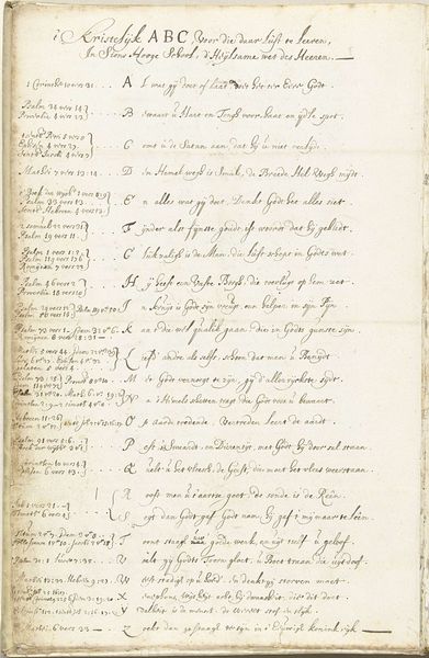
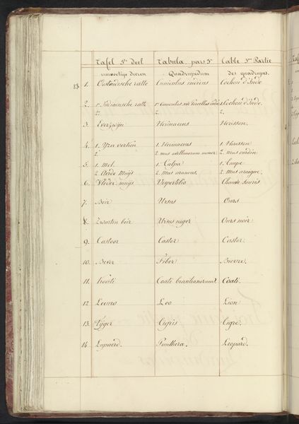
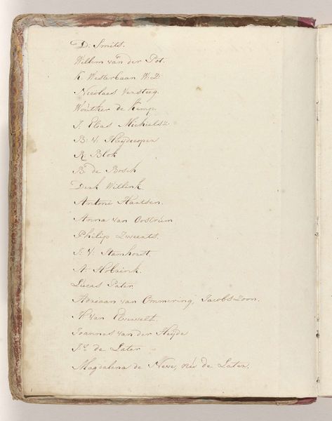
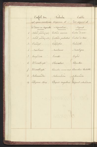
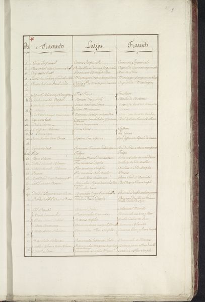
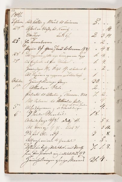
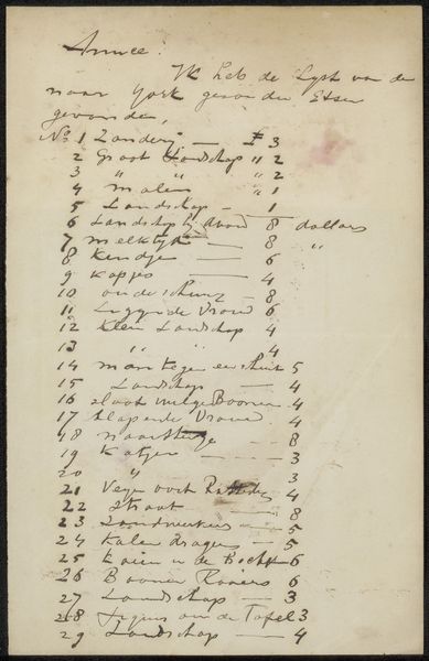
Curator: Before us, we have a drawing titled "De verloren zoon als varkenshoeder," which translates to "The Prodigal Son as a Swineherd." It was created by Philips Galle in 1562, and it's an ink drawing on paper. Editor: It looks more like a list than artwork! And the typography reminds me of a time where writing was carefully made and visually appreciated for it own merit, apart from its content. I also notice it seems to be written in Dutch? Curator: Indeed, the Dutch Golden Age fostered incredible levels of literacy and education, resulting in beautiful handwriting as we see in the use of ink and paper in this piece. If you look at the tags, this also fits within the themes of miniature art, and calligraphy! This artwork seems to represent an underlying material appreciation of art, text and design combined, beyond merely portraiture or similar. Editor: Yes, precisely! Considering that this sheet lists a number of different places around London suggests an important administrative function related to spatial awareness. Paper was precious at the time and ink expensive. Do we know about Galle's motivations? Curator: Galle was a printmaker and publisher who frequently dealt with religious and moral themes. He's best known for his engravings. The title alludes to the biblical parable, but this seems a list of some sort related to London; perhaps we see that intertwined here with religious or moral messages. Editor: Fascinating. Perhaps there is a connection, the labor involved with careful writing in such delicate medium—the list becomes valuable. Every stroke is precise and has weight and significance due to that. How very modern. Curator: Exactly! And in the context of the 16th century, the detailed craft makes it stand out, giving us today a special look into the materials, the act of artmaking and the place these had in society, especially compared to our time, saturated as we are by images. Editor: Yes. I initially thought that I'd be looking at a simple, boring script on a page. However, in considering materials and construction and the artist’s historical environment, it actually sparks an entirely new perspective.
Comments
No comments
Be the first to comment and join the conversation on the ultimate creative platform.
More like this