drawing, paper, ink
#
drawing
#
paper
#
ink
#
genre-painting
#
academic-art
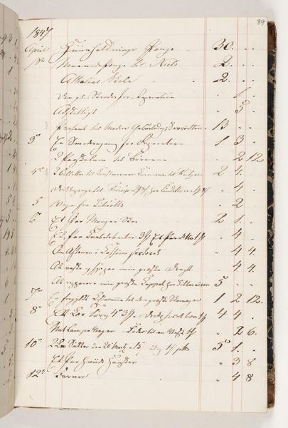
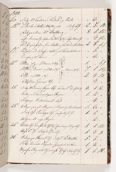
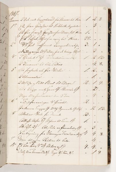
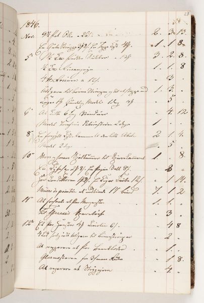
Dimensions: 200 mm (height) x 130 mm (width) (bladmaal)
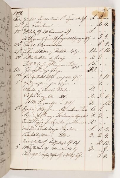
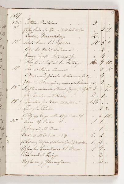
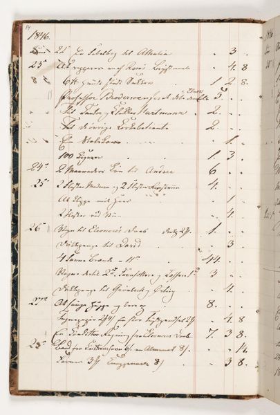
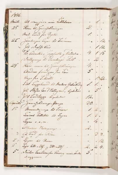
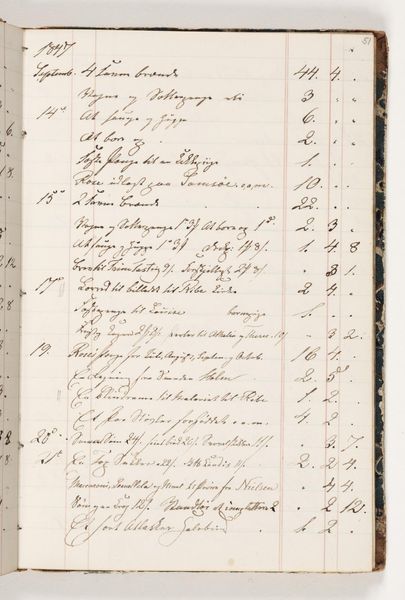
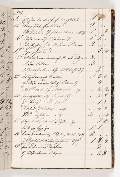
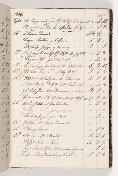
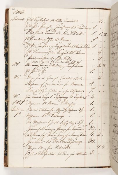
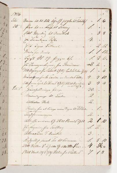
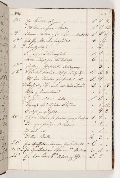
Editor: This is “Regnskab 1848” created in 1848 by Martinus Rørbye. It's an ink drawing on paper, held at the SMK. The writing is so delicate; it looks like a page ripped straight out of history. What compositional elements strike you most? Curator: Immediately, it's the stark division of the picture plane that grabs my attention. The ordered, ruled lines create a rigid structure, against which the cursive script introduces an element of fluidity. Consider the contrast: mechanical precision meeting organic form. How does that interplay manifest itself within the totality of the work? Editor: I guess the columns organize information. But then there's the script; it almost becomes an abstract element, creating texture and pattern on the page. It contrasts and blends. What might he want to convey by those dualities? Curator: Precisely. We see structure and dissolution interlocked. Consider the materiality, too: ink laid upon paper. What potential can be derived when we analyze such basic building blocks? Note also the aging: see how the ink has faded? This aging itself adds a layer, wouldn’t you agree? Editor: Yes! It transforms the object and deepens the structure as well. The aged paper reminds us of temporality; that is, ink on paper is permanent but not eternal. Curator: An excellent observation. Through analyzing the structural dichotomies present within the work's form and materiality, a more profound appreciation begins to develop. This type of systematic breakdown and critical reading, can enrich the way one might observe. Editor: I learned that going beyond just looking and instead focusing on analyzing components provides so much context, it transforms what seems to be a boring record. Curator: Indeed. An astute eye provides its own cultural value.
Comments
No comments
Be the first to comment and join the conversation on the ultimate creative platform.
More like this