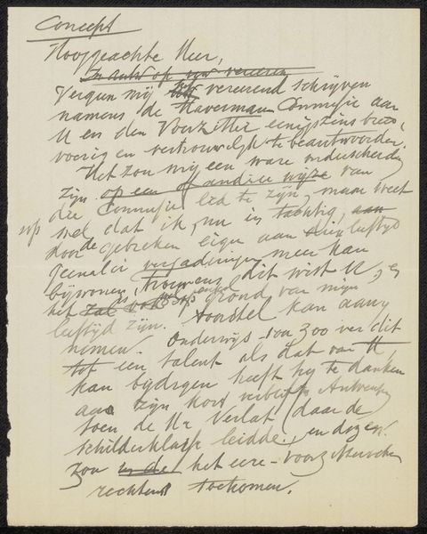
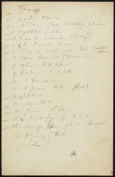
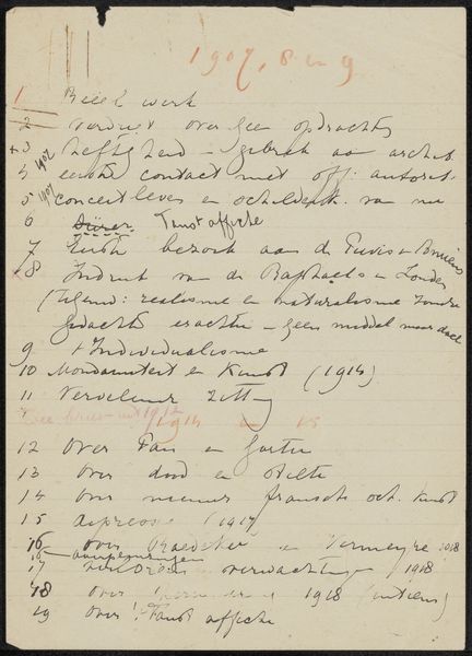
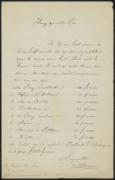
drawing, paper, ink, pen
#
drawing
#
hand-lettering
#
ink paper printed
#
old engraving style
#
hand drawn type
#
hand lettering
#
paper
#
personal sketchbook
#
ink
#
hand-drawn typeface
#
ink drawing experimentation
#
pen-ink sketch
#
pen work
#
pen
Copyright: Rijks Museum: Open Domain
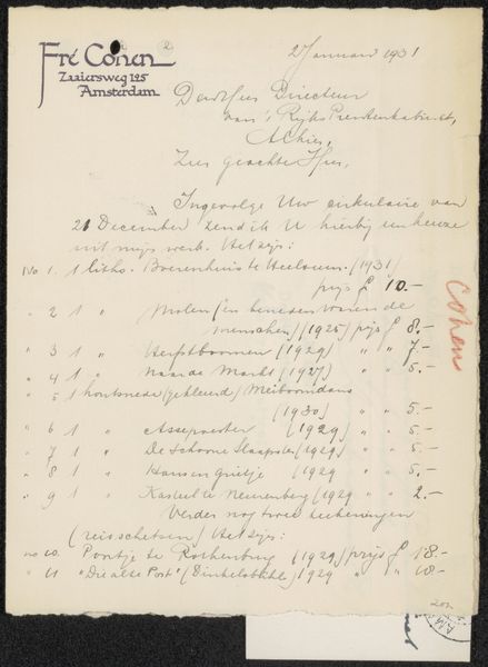
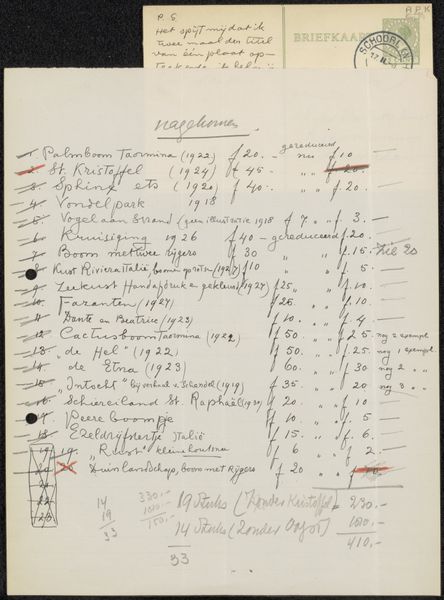
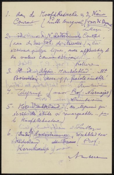
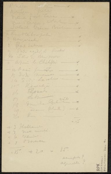
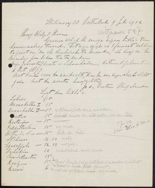
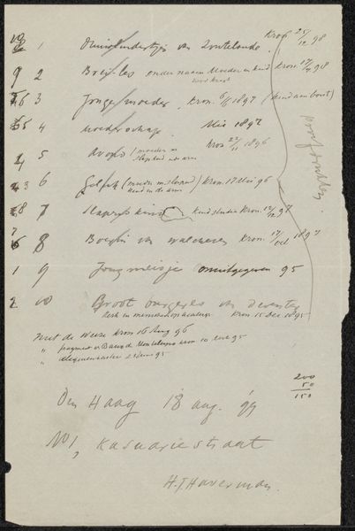
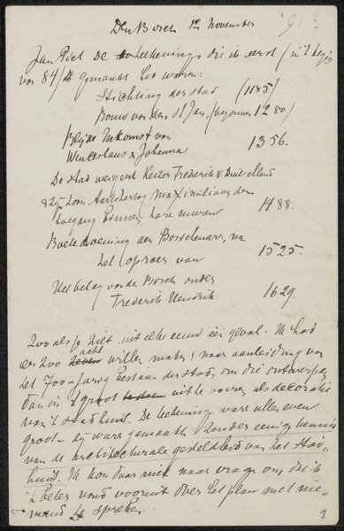
Editor: This is a drawing entitled "Brief aan Cornelis Gerardus 't Hooft" made possibly in 1907 by Jan Veth. It appears to be a handwritten letter rendered in pen and ink. I'm immediately struck by its density and the almost hypnotic rhythm of the handwriting. It looks like a page torn from someone’s sketchbook. What captures your attention most? Curator: That "torn from a sketchbook" feeling is spot on. For me, it's about seeing the artist's mind at work. This isn't a polished presentation piece; it’s raw, intimate. You are essentially reading Veth’s thoughts, his shopping list, his to-do, written in such a unique and attractive style. You get the impression that he did not distinguish between what he called art or a necessity of life. Editor: A shopping list? It's a list of some sort. But does the content add to our appreciation? Curator: Absolutely! Consider that Veth was more than just an artist, he was deeply invested in the cultural and intellectual life of his time, plus an expert on the graphic arts, so even a letter carries the weight of his aesthetic sensibilities. The handwritten nature makes it even more special, don't you think? Each curve, each flourish of the pen, they contribute to the overall impression. I read that Cornelis was a typographer and printer by trade, adding another layer to this "Brief", Editor: I see your point. Knowing that Veth gave special care to penmanship, and that his friend was a typographer gives the “sketch” deeper context. Curator: Exactly. It elevates the mundane, showing us that beauty and intent can be found even in the simplest forms of communication. Perhaps our lives, as we live them, have aesthetic weight beyond our knowing. What will people learn about your life based on your grocery list?! It might reveal everything! Thanks for your thoughtful contribution!
Comments
No comments
Be the first to comment and join the conversation on the ultimate creative platform.
More like this