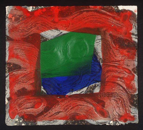
Dimensions: support: 434 x 482 mm
Copyright: © Howard Hodgkin | CC-BY-NC-ND 4.0 DEED, Photo: Tate
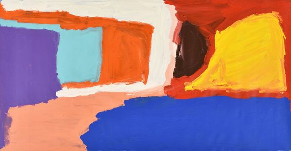
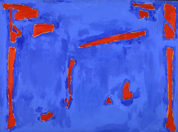
Curator: Howard Hodgkin's "Norwich" presents us with a bold interplay of colour and form, a visceral dance on the canvas. Editor: The striking red immediately grabs the eye. It feels assertive, almost disruptive against the calming blues. Curator: It's fascinating how Hodgkin uses colour as both a representation and a symbol. Blue, often associated with tranquility, forms a kind of container for the passionate red. Editor: I wonder, too, about the historical context. Does this colour dynamic reflect, perhaps, a specific tension or social narrative of the period? Curator: Potentially. Hodgkin was always deeply attuned to emotional resonance. Perhaps the painting explores the relationship between repression and expression. Editor: It's amazing how a few colours can evoke such complex social and individual readings. Curator: Indeed. Hodgkin's brilliance lies in his capacity to layer emotional experiences into deceptively simple forms. Editor: Well, I will definitely be reflecting on the symbolism of that red rectangle as I continue my day.
Comments
Join the conversation
Join millions of artists and users on Artera today and experience the ultimate creative platform.
tate 12 months ago
⋮
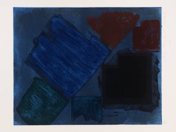
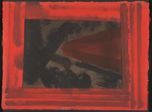
Norwich is a print that was intended to be a gift to the Elton John Aids Foundation, although in the event the print was not distributed. It was published in an edition of forty and printed by Jack Shirreff (born 1943) at the 107 Workshop, near Bath in England. The Tate copy is number forty in the edition. Hodgkin has made prints since the early 1960s and he and Shirreff first worked together in 1990, when he produced a number of prints inspired by exotic travel and travel posters (Tate P20058-P20062). He worked with Shirreff again in 1995, producing an edition of prints entitled Venetian Views (Tate P20166-P20169). They developed a close working relationship, Shirreff printing and hand-colouring all these editions. Norwich is a small, brightly coloured image that evokes the gestural immediacy of Hodgkin's gem-like paintings. It combines lift-ground aquatint and carborundum, with hand-colouring by Shirreff. Hodgkin has used an assistant to hand-colour his prints since the late 1970s when he worked on Nick 1977 (Tate P77044) with Maurice Payne at Petersburg Press. Hand-colouring has since become an integral aspect of the artist's print-making technique. The process of using a 'second' hand to colour the printed image was partly suggested by the art historian, Herbert Read (1893-1968). Hodgkin remembers having read of the anonymous decorators of pottery, and the memory influenced his practice. However, he no longer recollects the source of Read's description. According to Hodgkin, the artist is often tempted to alter an image through successive reinterpretations. In contrast, an assistant can be employed, almost as a mechanical tool, to duplicate marks. The 'original' of such hand-repeated marks is always made by an assistant under very close supervision by the artist. (All references from unpublished Tate interview.) Norwich was printed in black, grey and blue from three plates and hand-coloured in red, blue and white by Shirreff under Hodgkin's guidance. Mottled, pock marked strokes of black and grey form the bottom layer of the image, over which Hodgkin added a vibrant wash of ultramarine blue. This is overlaid by a hand-painted, window-like frame of titanium white mixed with blue. In the centre of the frame, and overlapping its edges, is a bold, wide brush stroke in pillar box red. The strength of the red contrasts with the dominant blues and blacks of the image, the red appearing to leap forward and the darker colours to recede, so creating movement and drama in the print. The blue and white frame parallels the characteristic frame-within-a-picture device of Hodgkin's paintings where the actual frame is often incorporated pictorially. The print has a layered, gestural quality that evokes the slow accretion of layers characteristic of the paintings. This results from Hodgkin's experimental manipulation of the printing processes in conjunction with hand-colouring. He used lift-ground aquatint to create the spontaneous, painterly printed marks that form the base of the image. The process enabled him to paint directly onto the plate. When the plate was printed, the ink mirrored the original painted mark. Hodgkin also used carborundum, a printing technique that gives the image a pitted, textured quality. The technique involves applying, with brush or hand, a stodgy carborundum paste that dries on the plate. When inked and printed the carborundum partly embosses the paper, giving the print a relief-like character. Like many of Hodgkin's prints and paintings, the title of the work probably alludes to an event in the artist's life. Hodgkin draws his inspiration from the memory of personal experiences and moments in time: a place visited, a meal eaten, a friend observed, a mood experienced or a moment recalled. These memories, moods and experiences are then imaginatively transformed, the prints and paintings evoking the depth and richness of lived experience. Further Reading:Howard Hodgkin: Small Prints, exhibition catalogue, Alan Cristea Gallery, London 2001, reproduced (colour) pp.9-10Howard Hodgkin: Venetian Views 1995, exhibition catalogue, Alan Cristea Gallery, London 1995Howard Hodgkin: Prints 1977-1983, exhibition catalogue, Tate Gallery 1985 Imogen Cornwall-Jones April 2002
More like this