Oud-Antwerpen Le vieil Anvers / tekst door Max Rooses; waterverfschilderingen en teekeningen van Frans Van Kuyck 1894
0:00
0:00
print, typography
#
aged paper
#
homemade paper
# print
#
hand drawn type
#
typography
#
hand-drawn typeface
#
fading type
#
thick font
#
white font
#
thin font
#
historical font
#
small font
Dimensions: height 156 mm, width 237 mm, thickness 9 mm
Copyright: Rijks Museum: Open Domain
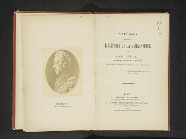
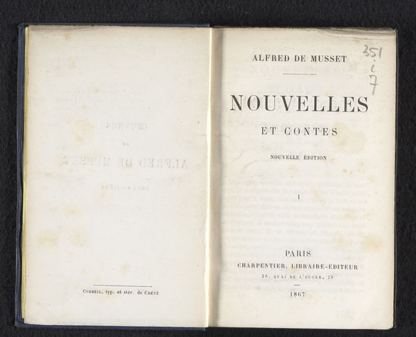
Curator: This striking example of typography, "Oud-Antwerpen Le vieil Anvers", dates back to 1894. The text is by Max Rooses, and the watercolours and drawings are the work of Frans Van Kuyck. Editor: It looks so fragile! I feel like if I breathed on it, the whole thing would just turn to dust, like some antique spellbook. Curator: Indeed, the paper has clearly aged, bearing the marks of time. I'm particularly drawn to how the varying thicknesses of the hand-drawn typeface creates a layered effect, almost like palimpsests. Editor: A palimpsest, huh? Like layers of meaning etched on top of each other. I get that. The text feels almost spectral, you know? Like you're reading a ghost's shopping list or something. Curator: The very choice of lettering itself speaks to the era, to the values of that time. Note how some of the font styles appear quite dense, almost compressed, and others, whisper thin. I see a visual metaphor for the tightly-packed streets and grand boulevards existing side by side in Old Antwerp. Editor: Oh, that’s neat! And the title jumps out, doesn’t it? "Old Antwerp." It makes me wonder, what did they think was worth remembering? What parts of their past were they already mourning? It makes one think about nostalgia, the city as a repository of memories. Curator: I concur, the handwritten quality adds a deeply personal feel, as though Rooses and Van Kuyck were consciously archiving the spirit of their city, understanding the need for tangible connection to a quickly disappearing past. It’s a cultural time capsule presented in dual languages. Editor: Well, for me, looking at it now, it makes me want to dig through old photo albums. What's hidden between the lines, that's what gets me going. Curator: A perfect summary of the work, perhaps. A glimpse into history, and into ourselves. Editor: I'll second that! This definitely pulled me into a particular mood of reflection.
Comments
No comments
Be the first to comment and join the conversation on the ultimate creative platform.
More like this