Omslag met 12 prenten van de Universiteit van Amsterdam 1902
0:00
0:00
print, typography, poster
#
art-nouveau
# print
#
typography
#
poster
#
historical font
Dimensions: height 309 mm, width 248 mm, thickness 8 mm
Copyright: Rijks Museum: Open Domain
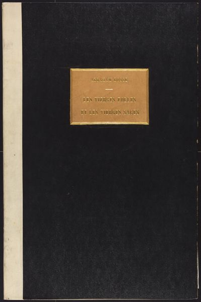
Curator: Here we have an intriguing Art Nouveau print, "Omslag met 12 prenten van de Universiteit van Amsterdam," created in 1902, and designed as a cover by Academische Boekhandel Delsman & Nolthenius. Editor: It's visually arresting! The maroon color immediately gives it a serious tone, offset nicely by that gold lettering in elegant swooping typeface, softened just so with the linear central ornament. The material feels aged; time worn even though the typography remains clean and well preserved. Curator: Yes, it evokes a certain academic weight, doesn’t it? That font certainly speaks to the period—notice how it uses flowing, organic lines characteristic of Art Nouveau, yet still maintains a level of formality appropriate for the subject. This combination lends an aura of sophistication. Editor: Absolutely. And thinking about this as a cover intended to contain twelve prints, its purpose is both functional and symbolic. The material quality becomes particularly interesting; I would speculate that they employed printing methods suitable for long use as its cover design indicates value in its construction. Curator: Indeed. We can interpret the choice of typeface as deliberate signaling; projecting an image of learning and intellectual prestige. This choice subtly enforces a continuity with a historic cultural identity the university claims. The ornament separating the album title and bookstore contact further enforces hierarchy and balance in composition. Editor: Precisely. It bridges utility and art so effectively, that makes you think about access too. Mass-produced, it also democratizes notions around higher learning. A way to signal prestige not only through knowledge but through artful consumption as well, and thus blurring the distinction between everyday and "high art." Curator: A fitting perspective. Reflecting on it all now, I'm left considering how carefully selected graphic design of this era contributed so greatly to the construction and projection of institutional identity, something that really carries meaning still today. Editor: Agreed, seeing how craft production was instrumental in producing works that transcend purely functional objectives gives one hope too. And perhaps why those elements resonate strongly with contemporary eyes as well!
Comments
No comments
Be the first to comment and join the conversation on the ultimate creative platform.
More like this