#
chicago-imagists
Dimensions: image: 68.9 × 43.5 cm (27 1/8 × 17 1/8 in.) sheet: 60.64 × 39.69 cm (23 7/8 × 15 5/8 in.)
Copyright: National Gallery of Art: CC0 1.0
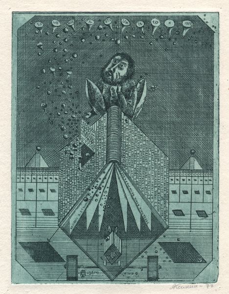
Roger Brown made “Disasters” in 1973, and what strikes me first is the way he uses flat, graphic shapes, which remind me a bit of the work of Phillip Guston, but with an almost unsettlingly neat, clean style. The buildings, rendered in cool grays and blues, are criss-crossed like toppling dominoes, while little figures tumble out. The surface is smooth, the colors are contained, and yet, there's this chaotic energy to the scene. Look at how the flames are depicted with these crisp, unwavering lines – it’s almost as if he is creating a disaster scene with a very calm hand. It's that tension between control and chaos that makes this piece so captivating. The color palette is mostly cool blues and greys, and then BAM, the fiery orange flames. It's like a controlled explosion, and this push and pull is where the emotional charge of the work resides. It makes me think about H.C. Westermann, with his similarly off-kilter and darkly funny work. Art is this conversation across time, and Brown definitely had something to say.
Comments
No comments
Be the first to comment and join the conversation on the ultimate creative platform.
More like this