Copyright: Public Domain
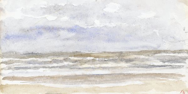
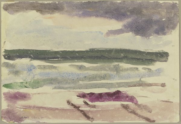
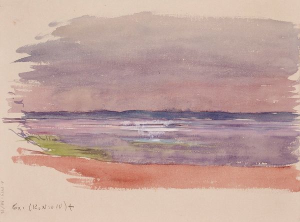
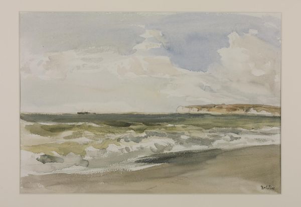
Arno König made this watercolor, 'Surf (motif from Sylt),' and it feels like a fleeting impression. König uses washes of muted purples, greens, and browns, creating a hazy, dreamlike atmosphere. You can sense the landscape, but it's more about feeling the place than seeing it clearly. The paint is thin and transparent, allowing the white of the paper to peek through, which adds to the sense of light and air. Look at how the colours bleed into each other, especially in the sky. This creates a sense of movement, like the clouds are shifting or the waves are crashing. The dark horizontal brushstroke right in the middle of the image helps define that horizon line, acting like a kind of anchoring element, it creates this really interesting and dynamic contrast between the chaos of the sea and the grounding presence of the earth. König reminds me of other landscape painters who are less about detail and more about capturing a mood. Think of someone like Emil Nolde. Like Nolde, he uses colour to express emotion and to convey the feeling of being in a particular place at a particular moment. It's less about what you see and more about how it makes you feel.
Comments
No comments
Be the first to comment and join the conversation on the ultimate creative platform.
More like this