Dimensions: height 412 mm, width 330 mm, height 407 mm, width 322 mm
Copyright: Rijks Museum: Open Domain
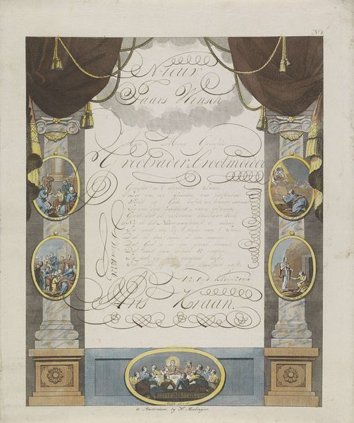
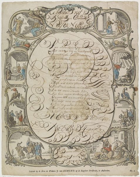
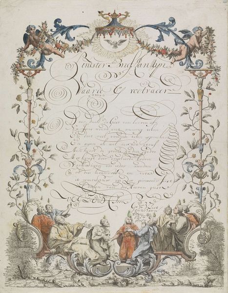
Curator: At first glance, this print's overall composition feels delightfully ornate. The lines are clean, but the pastel colors give a sense of gentleness. Editor: This is "Wensbrief met de aanbidding door de koningen," a watercolor print dating from around 1774 to 1775. The printmaker is known only by the moniker Monogrammist IFL, their identity shrouded in mystery. It depicts the Adoration of the Magi. Curator: Right, I see the three kings presenting their gifts to the infant Jesus. Knowing the print dates back to the late 18th century, it's intriguing to see this scene cast against a backdrop of political unrest and evolving social structures. What could this idealized nativity have signified? Editor: We see familiar visual elements, of course. The balanced columns provide a sense of stability, while the framing baroque ornamentation creates a structured hierarchy of text and image. There's also the masterful calligraphic script cascading between those pillars. Curator: Indeed. We could read the elaborate script above the adoration as a visual symbol of the divine mandate, yet, its placement between the columns also brings forth the societal structures reinforcing the monarchy. Who had access to the promises conveyed here? Were those promises upheld equitably? And how might the artist subtly signal resistance? Editor: Well, let's consider the figures in the adoration scene. Their postures are relatively static and presented in an understated palette which adds to its visual refinement. The artist employed watercolours in a way that directs our attention towards specific points in the image. Curator: Considering it was likely a personalized “wensbrief” or a wish letter for a very particular patron, it serves to understand its impact within a micro-context. How was the image understood by its intended recipient? What specific nuances resonated within that social setting? It's here we start to decode how meaning was made. Editor: A valuable interpretation. The use of color and symmetry creates an impression of formality which perhaps was well-suited to the cultural nuances of its time. Curator: Absolutely. Ultimately, it is up to us to contextualize and question that supposed tranquility with attention to the social and political landscape. Editor: Yes. What starts as formal beauty becomes a bridge to new perspectives.
Comments
No comments
Be the first to comment and join the conversation on the ultimate creative platform.
More like this