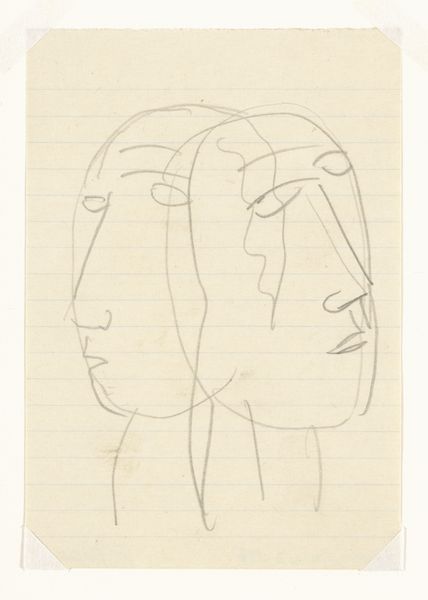
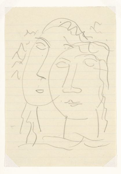
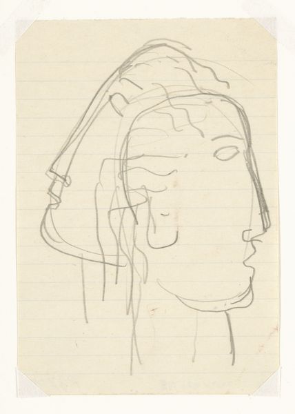
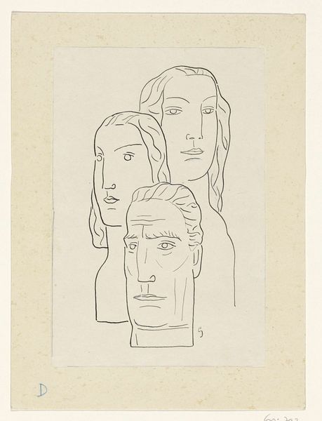
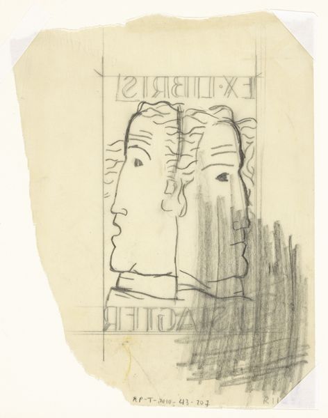
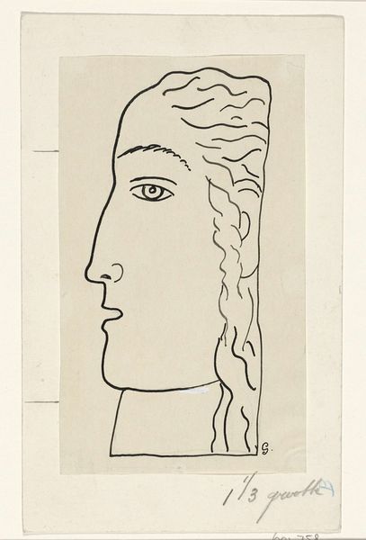
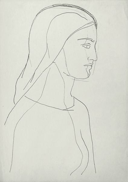
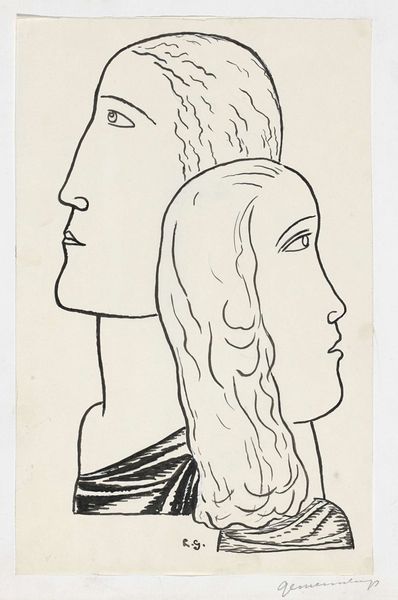
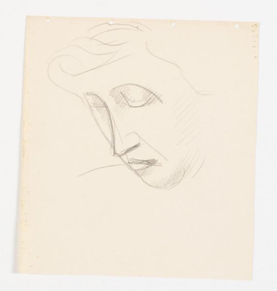
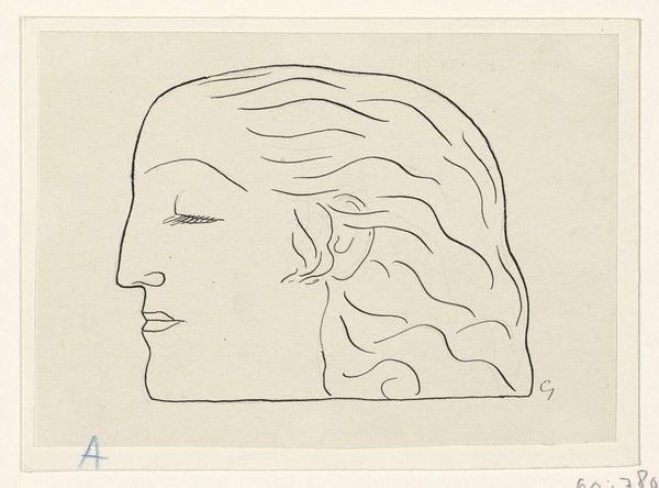
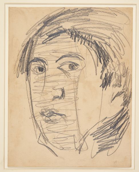
Omslagontwerp voor: Paul Fierens, L'art hollandais contemporain, 1933 c. 1931 - 1933
0:00
0:00
leogestel
Rijksmuseum
Dimensions: height 122 mm, width 85 mm
Copyright: Rijks Museum: Open Domain
Curator: We’re looking at Leo Gestel’s cover design for Paul Fierens’ book, “L’art hollandais contemporain,” made around 1931-1933. It’s here at the Rijksmuseum. Editor: Wow, there's a striking vulnerability to this seemingly simple pencil drawing. It feels raw, unfinished—almost like a ghost of a portrait, trapped between thought and paper. Curator: Precisely. Gestel's expressionistic style, rendered here in just a few delicate pencil lines on what looks like notebook paper, encapsulates a sense of transient melancholy, a kind of restless contemplation. It's like peering into the subject's inner world. Editor: The lined paper beneath the drawing makes me consider it in a more utilitarian way. What was the nature of these materials, the graphite, the paper? Was it a choice expressive of rejecting "high art" materials? Was the drawing considered part of the commodity of art at all? The book as a crafted object, produced by labor, printed, sold, consumed--it contrasts deeply with my immediate aesthetic interpretation of raw vulnerability, yes? Curator: A fascinating point. You are encouraging me to see a dialectical relationship between the commercial object and the vulnerability within it. Given that it was meant for a book cover, we must reflect on it within the landscape of publishing and its intersection with early modernism. Editor: Exactly. This feels different from, say, a large-scale painting, which is always marketed within specific hierarchies. I like that we have to wrestle with what might appear accidental here, on "notebook paper." It pushes us to consider how these design decisions challenge distinctions between commerce and fine art. Curator: It also speaks to the rapid production of imagery and ideas during this period. There’s an immediacy that's characteristic of Expressionism, certainly, but that also fits neatly within modernism's pursuit of new forms and functions for art and representation in mass culture. Gestel really delivers in a quick sketch a compelling portrait! Editor: Absolutely, I leave this sketch now wrestling with so many contradictions--consumption versus vulnerability, spontaneity versus industry, function versus fine art! Curator: As do I! Gestel really challenged our understanding about how different artistic styles, materials and design intersect with commodification in early 20th century.
Comments
No comments
Be the first to comment and join the conversation on the ultimate creative platform.
More like this