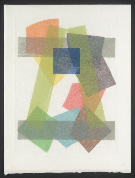
print, linocut
#
pop art-esque
# print
#
linocut
#
pop art
#
linocut print
#
geometric
#
abstraction
#
pop-art
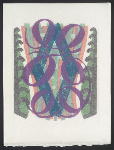
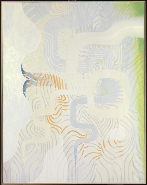
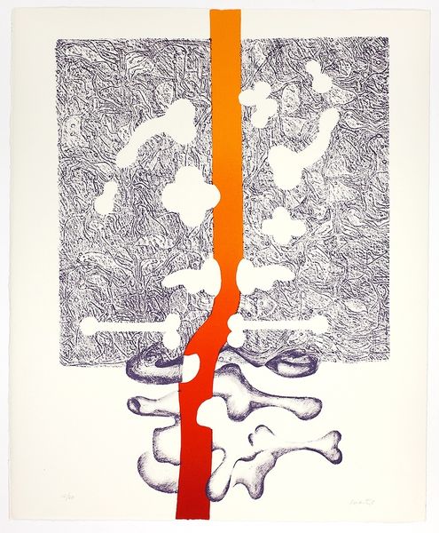
Copyright: Konrad Lueg,Fair Use
Curator: Looking at this print by Konrad Lueg, a work titled "Untitled (Negative Von Glanzbildern)," what's your initial impression? Editor: It's vibrant! The blocks of color almost vibrate against the neutral background. The crude texture gives it a raw, immediate feeling. I'm curious about the artist’s intent to produce these layered geometric figures. Curator: Lueg was very much engaged with the intersection of art and popular culture. His work often engages with consumerism and the post-war landscape of Germany. This "Untitled" piece seems to be pulling from the visual language of advertising and commercial printing of the time. Editor: Absolutely, the visible linocut texture and simplified shapes evoke the feel of mass-produced imagery. But is Lueg critiquing or celebrating this culture? Or perhaps just exploring a new visual vernacular. The very nature of the printing process also highlights the act of repetition. Curator: Perhaps both! There’s definitely a critical edge in his Pop art practice. Considering that Lueg created the piece sometime within his active years of 1960s-90s, its place in the societal shift happening globally is interesting. Editor: I also find the choice of a linocut interesting given Lueg’s experimentation of visual language and engagement with printing methods. The roughness of the linocut is really integral to how the form takes place. It seems very deliberate and very powerful to how we perceive the color. Curator: I think understanding Lueg’s artistic goals, we can think about how identity can be shaped by this continuous engagement with commercial forms and how our relationship with modern advertising is rooted in class struggles. Editor: I’d agree that there's definitely more to unravel there. Overall, I'm taken by the bold simplicity. Curator: Indeed, there’s a very compelling tension at play between the apparent straightforwardness of form and a rather intricate critical depth.
Comments
No comments
Be the first to comment and join the conversation on the ultimate creative platform.
More like this