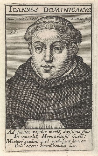
print, engraving
#
portrait
#
baroque
#
dutch-golden-age
# print
#
figuration
#
line
#
portrait drawing
#
engraving
Dimensions: height 100 mm, width 60 mm
Copyright: Rijks Museum: Open Domain
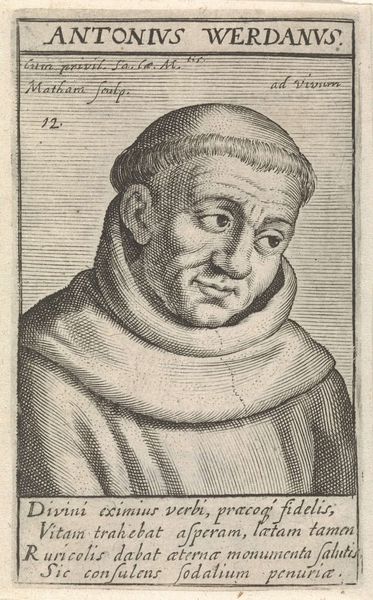
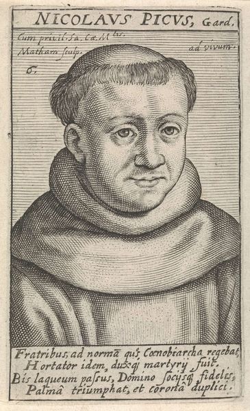
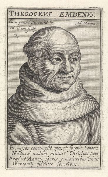
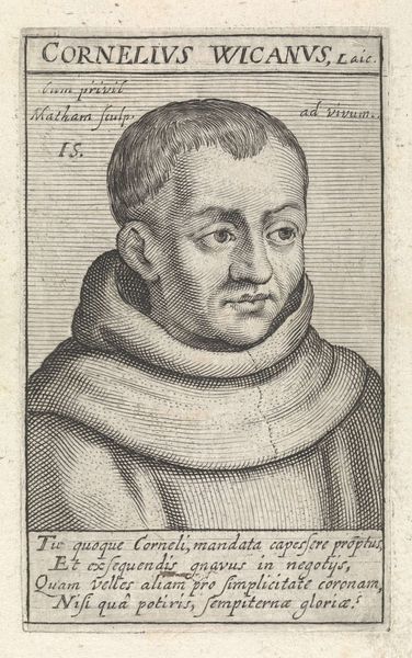
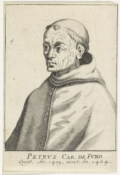
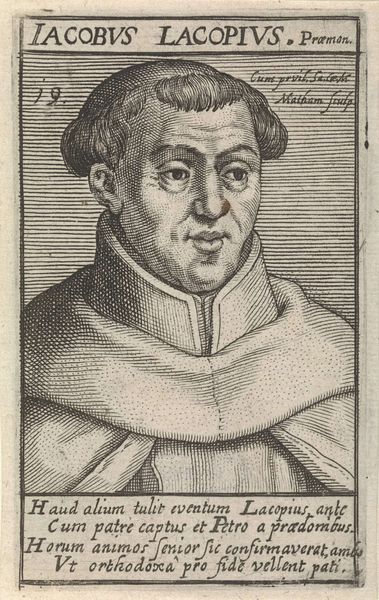
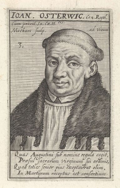
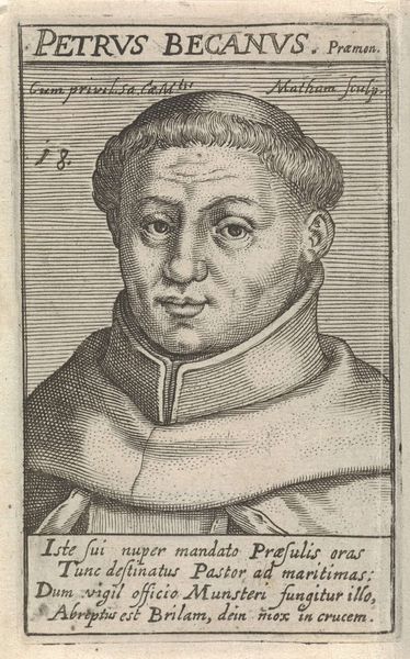
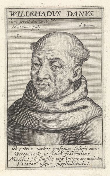
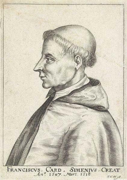
Editor: Here we have "Portret van H. Petrus van Assche," an engraving by Jacob Matham from around 1617 or 1618. The crispness of the lines really strikes me; there's almost a mathematical precision to it. What compositional elements stand out to you? Curator: Observe the deployment of line. The artist’s capacity to render both form and texture through varying densities and directions of engraved lines is masterful. Note how the closely packed, almost parallel lines in the sitter’s robe create a sense of depth, contrasting with the more openly spaced lines defining his face. The formal structure itself relies on stark contrasts. Editor: It is indeed very contrasting. The shading creates volume... But, is that all that can be seen? Curator: Consider how the formal qualities contribute to the overall effect. The tightness of the engraving creates a sense of focused intensity, mirroring the gravity perhaps intended in the subject’s depiction. Also note the lines of text, almost like bars to a cell - this portrait may suggest the limitations imposed by society, family or profession. Editor: I see, it’s the precision and arrangement that drives interpretation. So the meaning is actually embedded in the how the work is produced... Curator: Precisely. We can appreciate how Matham used the visual language of engraving not just to represent but to suggest something about the individual and the conditions under which they lived. Editor: I never thought to look at engravings this closely; I appreciate this fresh way to appreciate the beauty of the engraving medium and its relationship to the work's concept!
Comments
No comments
Be the first to comment and join the conversation on the ultimate creative platform.
More like this