Copyright: Joe Goode,Fair Use
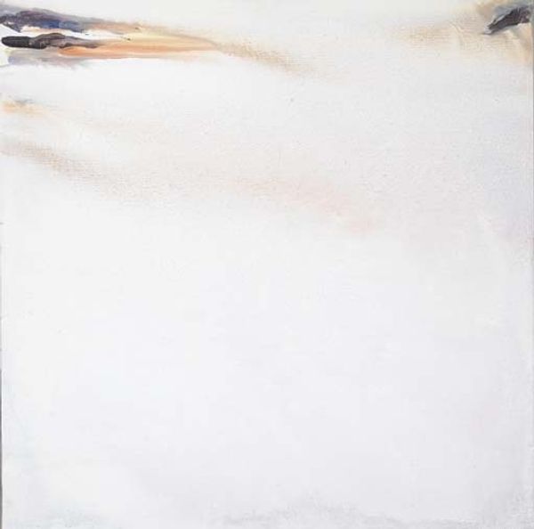
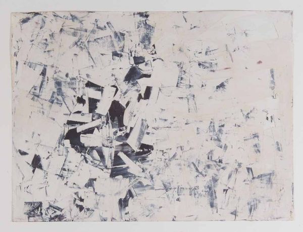
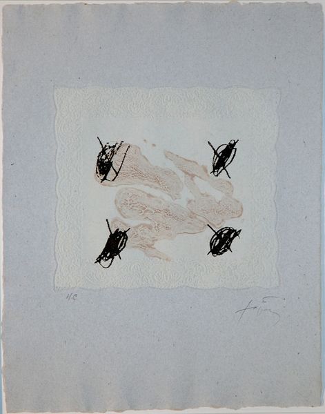
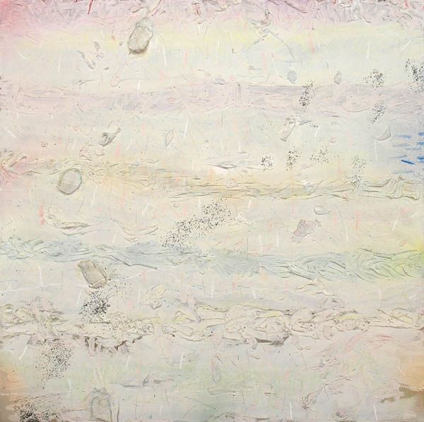
Curator: Welcome! Let’s explore Joe Goode’s "Untitled No. 4" from 1974. The piece uses acrylic paint and ink to explore abstraction. What strikes you most upon first viewing? Editor: There’s a quiet tension in the push and pull of geometric form—a study in the materiality of flatness as defined by color. I immediately note the restrained pastel palette, creating a subtly fractured plane. Curator: Goode often uses industrial materials, drawing a fascinating connection between his art and the wider socio-economic landscape of 1970s America. The delicate palette you pointed out is so unexpected, contrasting the potential rigidity implied by the shapes. Editor: Agreed. By embracing ink and watercolor, he creates a visual dance between structure and fluidity. There’s an emphasis on semiotics and the philosophical value inherent in these aesthetic choices. The negative space, particularly, emphasizes those pink islands. Curator: His exploration of the tension and relationship between those contrasting pink shapes could signify a deconstruction of traditional boundaries. His work often interrogates artistic consumption and production during this post-impressionist, modern era. Editor: Yes. Those torn edges, like peeling skin, almost betray the constructed nature of painting. Through his careful orchestration of color and composition, we see this fragility as a kind of rebellion against fixed meanings. Curator: Indeed, and perhaps that is what draws so many to Goode's artworks. Thank you for exploring this piece with me. Editor: The pleasure was all mine. Examining this piece has further solidified my thinking about how artists imbue materials with philosophy.
Comments
No comments
Be the first to comment and join the conversation on the ultimate creative platform.
More like this