graphic-art, print, paper, typography, woodcut
#
graphic-art
#
aged paper
#
toned paper
#
art-nouveau
#
homemade paper
#
pale palette
#
yellowing background
#
ink paper printed
#
parchment
# print
#
old engraving style
#
retro 'vintage design
#
paper
#
tea stained
#
typography
#
woodcut
Dimensions: height 350 mm, width 276 mm
Copyright: Rijks Museum: Open Domain
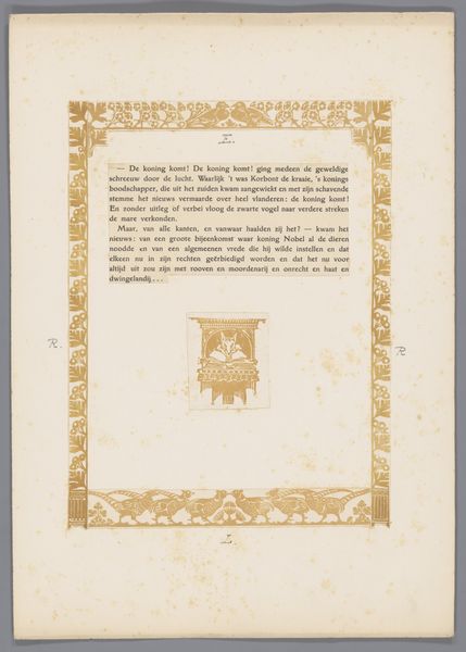
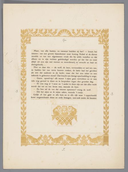
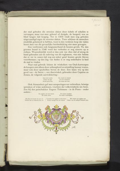
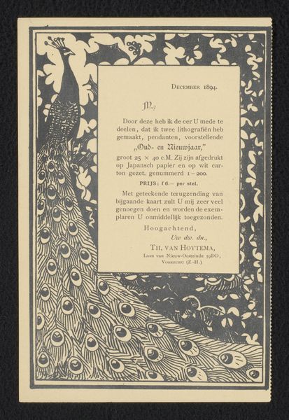
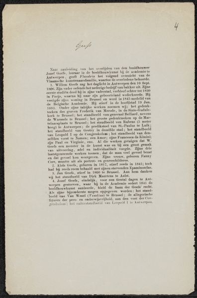
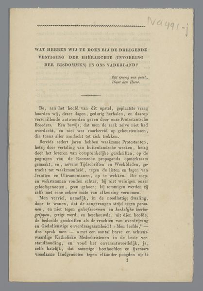
Editor: Here we have "Proefdruk voor pagina uit Reinaert de Vos," a print by Bernard Willem Wierink, dating back to around 1910. It’s got this wonderfully aged, almost parchment-like quality. What strikes me is the yellowing of the paper itself. How do you read this piece? Curator: The "aged paper" as you described it, reveals a lot. Its materiality directs us to the production and consumption of printed matter around 1910. The very process of producing this "Proefdruk," or proof print, would have involved a careful dance between the artist, the workshop, and the intended audience. This intermediary state tells us something critical. Editor: What do you mean? Curator: Think about the labor involved in producing this graphic art, this print. Woodcut is a slow, deliberate process. Was the intent here artistic, or was Wierink involved with a larger commercial project of illustration, design, and consumption? Consider the "Reinaert de Vos" narrative; the labor in printing here spreads awareness of such stories through a material commodity. The making, use, and re-use of it affects the telling. Is this high art or craft? Is there even a meaningful difference in this context? Editor: So it’s not just the image, but the journey of how it was made and its intended purpose? It challenges our assumptions about the categories of art and craft! Curator: Exactly! And about our own consumption and engagement with printed matter then and now. I find that quite fascinating, don’t you? Editor: I certainly do! I never thought I could interpret artwork based on how it was made. That's a new perspective to me.
Comments
No comments
Be the first to comment and join the conversation on the ultimate creative platform.
