print, metal, engraving
#
baroque
# print
#
metal
#
pen illustration
#
form
#
pen-ink sketch
#
limited contrast and shading
#
line
#
decorative-art
#
engraving
Copyright: Public domain
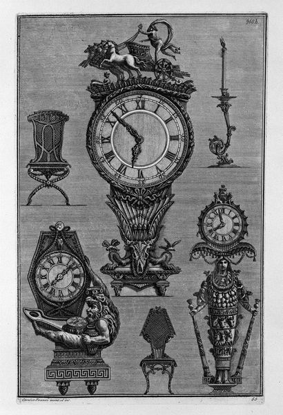
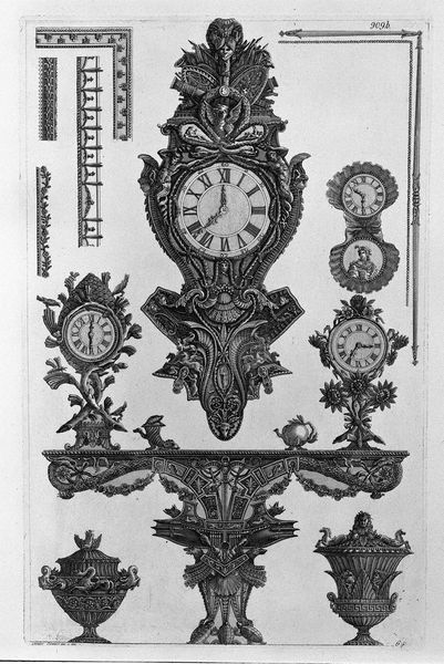
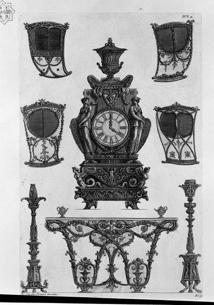
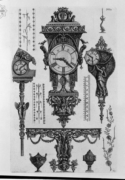
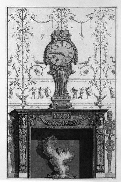
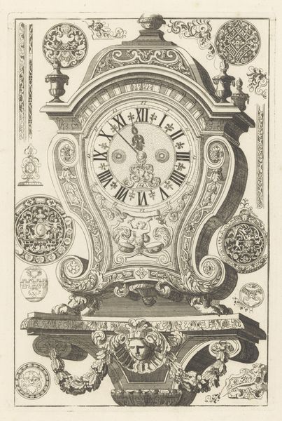
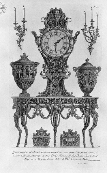
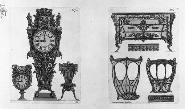
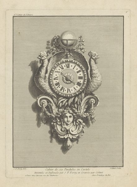
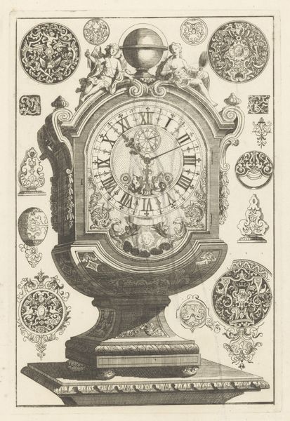
Curator: Here we have "Three clocks and three candelabra," a print by Giovanni Battista Piranesi. The medium looks like some sort of metal engraving. What's your immediate take on this one? Editor: It's Baroque excess, isn't it? Everything is ornate, twisting, layered with…meaning? There's something oppressive about it, almost suffocating in its detail. Curator: Well, let's delve into those details. Piranesi uses line and form to great effect, wouldn't you say? Notice the almost obsessive symmetry across the composition—clocks mirroring candelabras, repeated motifs... Editor: Right, but that symmetry feels strained, almost perverse. I'm struck by the labour involved in producing such an elaborate design, and then replicating it with an engraving. I'm thinking about workshops, apprentices, and the sheer volume of material needed to feed this appetite for extravagance. Curator: Ah, the material realities! The metallic gleam conjured through the print itself lends to that opulent effect. Focusing on the objects represented, though—the clocks aren’t merely functional; they are anthropomorphic! One is mounted on what seems to be a bust of Liberty, another by some sort of faun. This complicates straightforward functionality with symbolic weight. Editor: Exactly. What are the working conditions in clock or candelabra-making workshops at the time this engraving was made? The value is wrapped in both this "art object" but is actually representative of grueling work that has social impact in every little cut or etching across the image. Who had access to this supposed finery versus those that brought it into existence? Curator: A potent perspective. Perhaps we can appreciate the artist's technical skill without losing sight of the broader economic and social landscape. Consider how Baroque form signifies not just beauty but authority. The complex layering acts almost as propaganda for... Editor: Power, yes. But the materials of the print are just ink on paper that were likely consumed by other economic materials as well that give form and shape. The finished print just masks this process. Curator: It leaves me in a state of both intellectual intrigue and mild discomfort. Editor: Absolutely. It is in thinking about material impacts across classes that there may even be value within a Baroque aesthetic.
Comments
No comments
Be the first to comment and join the conversation on the ultimate creative platform.
More like this