Dimensions: height 125 mm, width 80 mm
Copyright: Rijks Museum: Open Domain
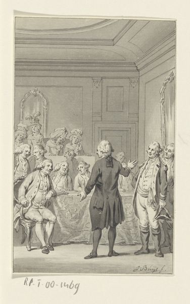
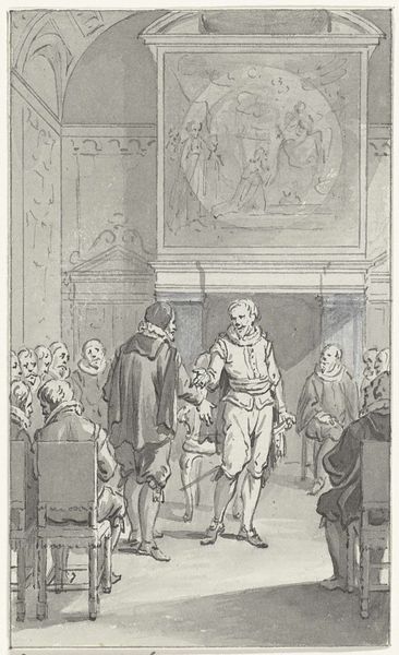
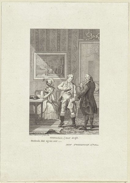
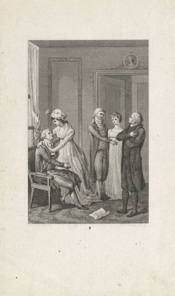
Editor: So, this is Reinier Vinkeles' 1784 pen and ink drawing, "Illustration for the Play 'The Duel of Jester'," currently at the Rijksmuseum. There’s something theatrical about the composition that immediately grabs you. What visual cues stand out to you the most? Curator: The pronounced linearity is striking. Note how Vinkeles orchestrates space not through tonal modulation, but by the assertive contours of each figure and object. The architecture, figures, even the framed picture on the wall, all adhere to a crisp, delineated form. Does that clarity diminish depth or enhance narrative focus, do you think? Editor: I can see that; it almost flattens the scene, making it feel very immediate, like we’re watching a play unfold right in front of us. That emphasis seems like it could be part of Romanticism, with an aim to affect the viewer directly. Curator: Precisely. Now consider the contrast. Observe the contained agitation in the figures compared to the static, ornamental background. Do these dynamic lines create dissonance within the frame? Or do they work together, unified, drawing your eye systematically? Editor: I think the unity works, if subtle, like the wallpaper echoing the folds in the woman's dress. Looking closely, there's an intensity of detail; despite the flattening effect, each figure feels like a real character. It shows off an economy of line, achieving expressive effects with just pen and ink. I see a lot I didn't see at first! Curator: Indeed. The very nature of the pen and ink medium allows the artist to use those linear elements to define form and dictate mood with minimal tonal variation. Ultimately it comes down to how successfully these visual languages converge, generating narrative resonance for the viewer. Editor: Definitely seeing it. Thanks, this deeper dive gave me so much to think about in future analyses!
Comments
No comments
Be the first to comment and join the conversation on the ultimate creative platform.
More like this