painting, acrylic-paint
#
painting
#
postmodernism
#
pop art
#
acrylic-paint
#
abstraction
Copyright: Clarence Holbrook Carter,Fair Use
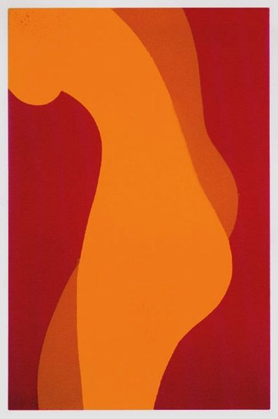
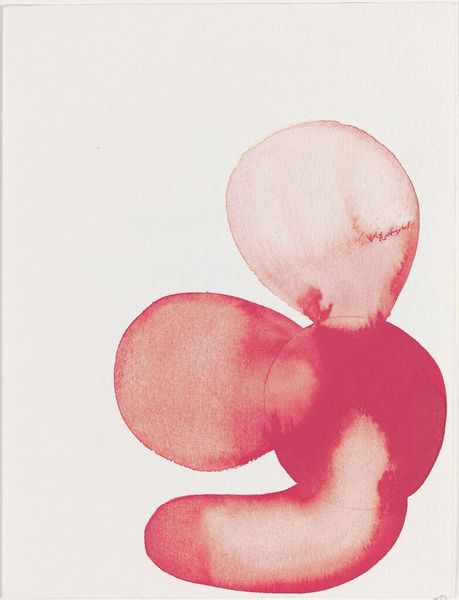
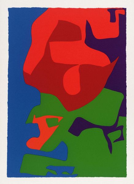
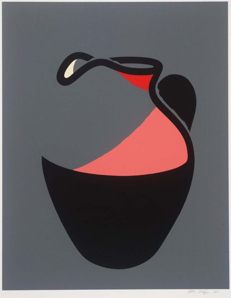
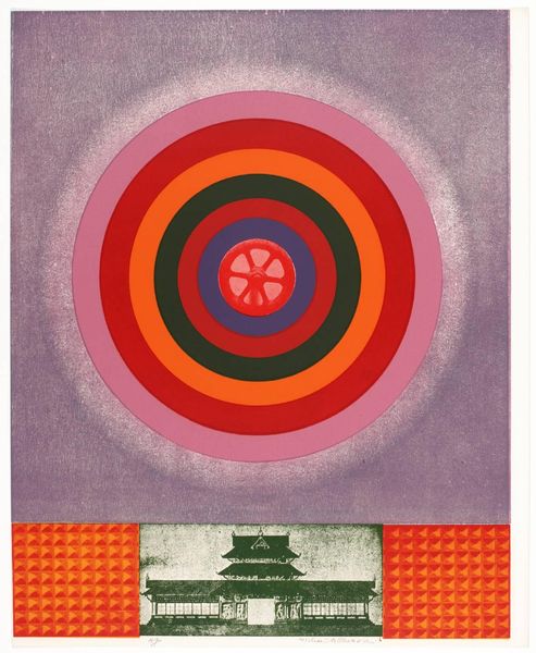
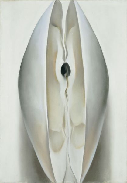
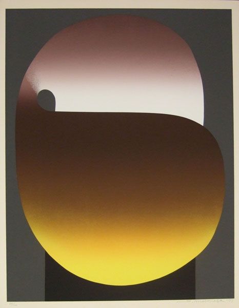
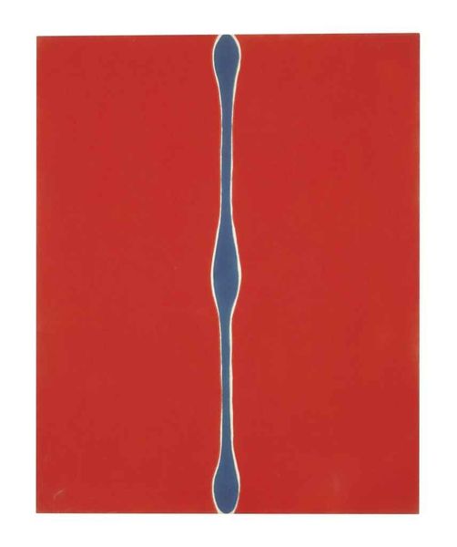
Clarence Holbrook Carter made this print, Abstract Tulip, sometime in the twentieth century, using a printmaking process. The red backdrop has a flat, even surface and an almost velvety texture. This creates a visual tension with the flower itself, which is rendered with a smoother, more luminous finish. I'm struck by how the artist simplifies the natural form, reducing it to its essential curves and lines. Look at how the petals unfurl, creating a sense of depth and movement. It’s a bit like those Matisse cut-outs but with a softer, more organic feel. The red really makes the form pop, like a stage set, and the choice to include a circular form above the flower suggests something beyond the literal representation of a flower. It's almost dreamlike, like a Georgia O'Keefe painting, but with a harder edge. I love art that embraces ambiguity and invites us to bring our own interpretations.
Comments
No comments
Be the first to comment and join the conversation on the ultimate creative platform.
