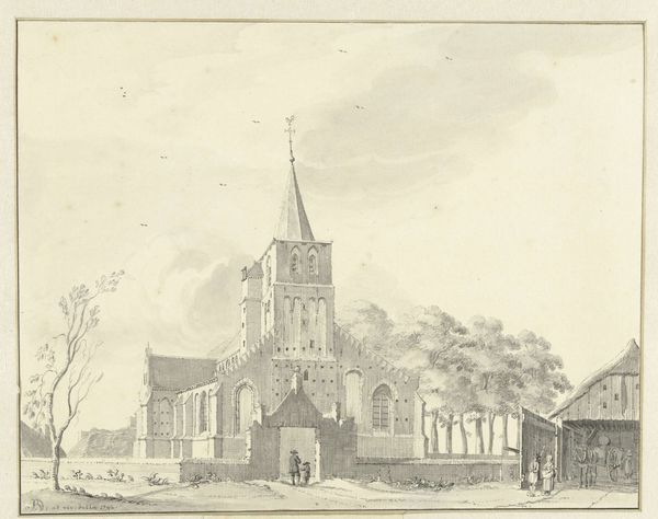
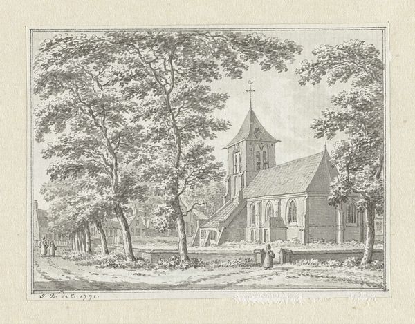
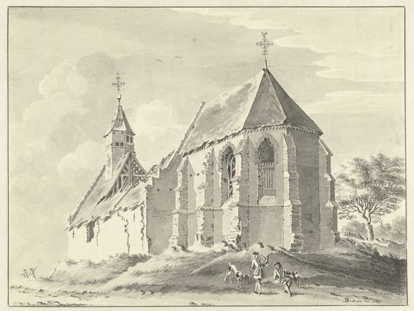
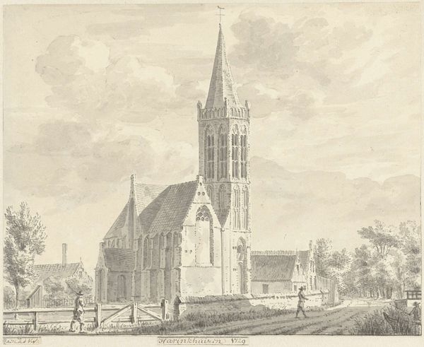
drawing, paper, ink, architecture
drawing
baroque
landscape
paper
ink
cityscape
architecture
Dimensions: height 253 mm, width 200 mm
Copyright: Rijks Museum: Open Domain
Editor: Here we have Jan de Beijer's "Kerk te Mierlo" from 1738, a drawing rendered in ink on paper. I'm struck by how the architectural lines of the church dominate the composition. What visual elements stand out to you? Curator: The linear precision in the depiction of the architecture commands immediate attention. The formal relationships—the tower’s verticality versus the horizontal emphasis of the church's body—establish a clear structural hierarchy. Note the skillful use of hatching to delineate form and create a sense of depth, particularly evident in the rendering of the clouds and the facade of the church. How does the tonal range contribute to the overall visual impact? Editor: I see what you mean; the limited tonal range really emphasizes the geometric shapes and almost flattens the scene, despite the artist’s attempts to create depth through perspective. It’s like the form is prioritized over the atmospheric effect. Is this typical of architectural drawings of the Baroque period? Curator: It is. This emphasis on line and structure, characteristic of the Baroque's later formal explorations, moves the viewer's attention to the artwork’s construction. The artist manipulates linear perspective, but ultimately contains the depth within the artwork’s two-dimensional surface. Consider the significance of this choice in relation to the function of architectural drawings at the time. Editor: It’s fascinating to think about how much intent is embedded in seemingly straightforward depictions. Thanks, I never considered the flattening aspect before! Curator: Indeed. Recognizing these formal choices enriches our appreciation of the artist's process and intent.
Comments
No comments
Be the first to comment and join the conversation on the ultimate creative platform.