painting, watercolor, pencil
#
portrait
#
water colours
#
narrative-art
#
painting
#
figuration
#
watercolor
#
coloured pencil
#
romanticism
#
pencil
#
line
#
genre-painting
#
history-painting
#
academic-art
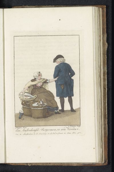
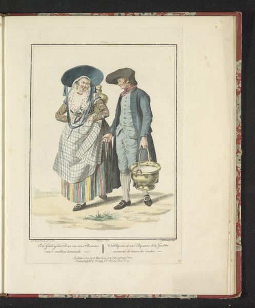
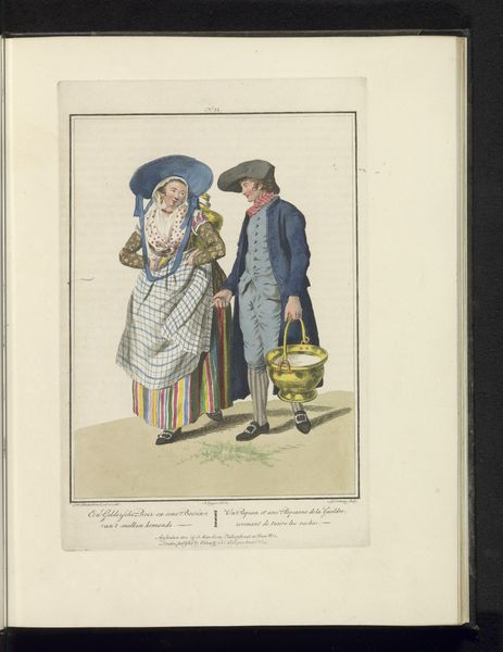
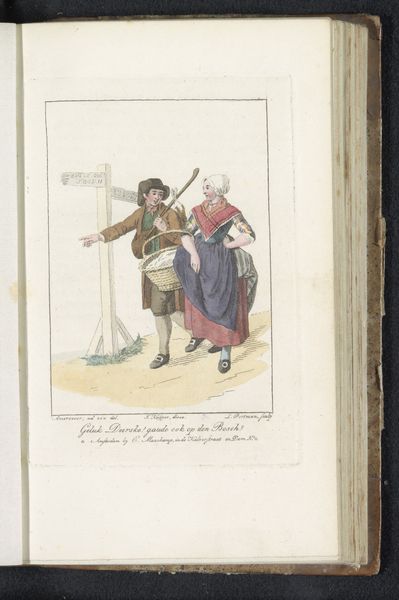
Dimensions: height 233 mm, width 160 mm
Copyright: Rijks Museum: Open Domain
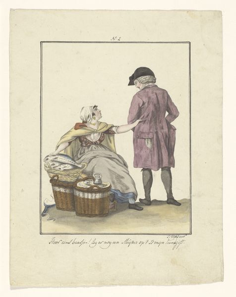
Curator: Let's consider Ludwig Gottlieb Portman’s "Visverkoopster en klant," created in 1803, currently residing here at the Rijksmuseum. A quaint watercolor, wouldn't you agree? Editor: Initially, I am struck by the palpable sense of the everyday – it evokes a feeling of observing a fleeting interaction in a bustling marketplace. The cool tones lend it a certain reserved atmosphere, despite its narrative focus. Curator: Indeed. If we observe the composition closely, the figures are arranged within a precisely defined pictorial space. Note the line work, very precise and controlled, particularly around the faces and the drapery of the fishmonger's clothing. Editor: But it's more than just observation; it speaks of labour, doesn’t it? These aren’t idealized figures. Consider the fishmonger: her worn expression, the texture of her coarse clothing. We are shown not just people, but the very materials and social stratification of labor. I am captivated by her weary arm gesture – a signal for an honest price. Curator: An excellent point. There’s a careful balance achieved by contrasting textures within a limited chromatic range, particularly between her garb and that of her customer’s more refined apparel. Observe, too, the basket weaves: it is carefully planned; note the way light strikes different areas in each plane. Editor: For me, the real story lies in the implicit connection being brokered through the materiality of the fish, a stark reminder of the economy of everyday life during that period. And I’m thinking about the context: the rising merchant class and increased trade transforming daily existence. Curator: The subdued palette really directs our gaze towards this narrative's structured format: we are drawn by means of contrast within limited hue variation. Editor: Overall, its brilliance lives within its intimate, approachable scale. In scrutinizing such details, it highlights something about the quiet lives and material conditions of late 18th-century Amsterdam society. Curator: Through precise lines and chromatic relationships, Portman elevates genre-painting, transcending it, no? Editor: And, in turn, his work helps illuminate the networks of people and production which shaped the time.
Comments
No comments
Be the first to comment and join the conversation on the ultimate creative platform.
More like this