About this artwork
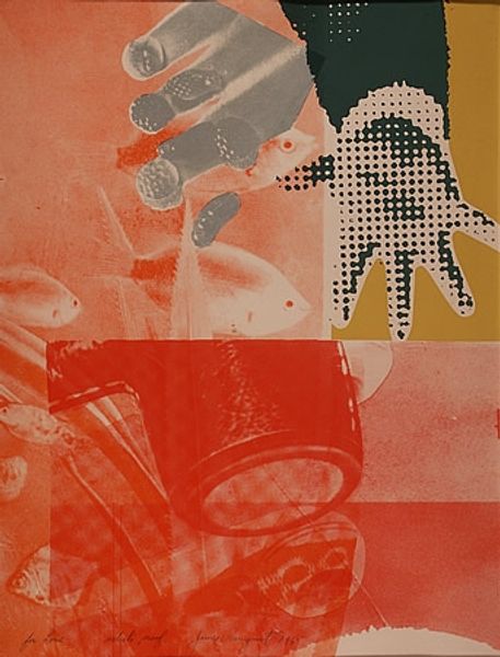
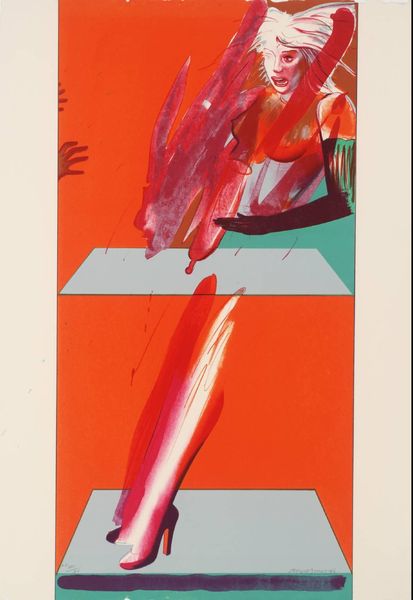
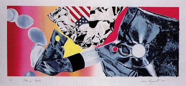
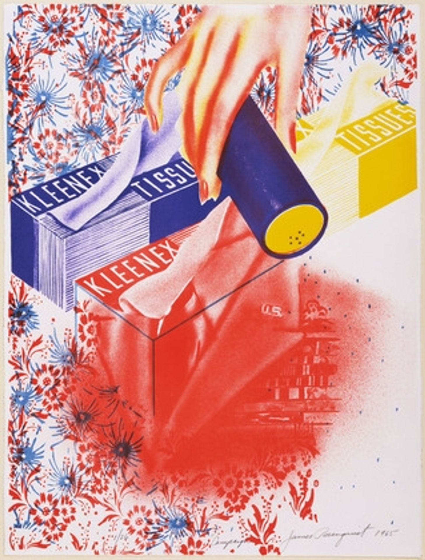
Curator: Welcome. We're standing before James Rosenquist's "Campaign," created in 1965. What’s your initial impression? Editor: A little unsettling, honestly. It’s bright, and those clashing images...it’s like advertising jumbled with unease. Like a fever dream after watching too many commercials. Curator: Precisely! Rosenquist was a master of juxtaposing seemingly unrelated images to comment on consumer culture and political themes. Observe the crisp rendering of common household objects, specifically the Kleenex boxes alongside the blurry red figure fading to the bottom of the painting. What do you make of their relationship, if any? Editor: Well, there's a very large hand placing what seems to be lipstick near these boxes. Everything feels mediated somehow—sanitized, even. Is this suggesting that these 'campaigns', and consumer culture more broadly, make us sick, force us to sanitize away our own messiness? And is that really lipstick? The blue tool doesn't appear to dispense it well! Curator: Intriguing. The large hand certainly suggests a controlling force. Moreover, the background, composed of small but countless red and blue flower images suggests this is an all encompassing social situation. Given the date, do you see a parallel with Cold War tensions? The image may be implying consumerism itself became a battleground. Editor: Definitely. I also can’t ignore the fragmented figures; the visual chaos, they speak to something fractured, like a nation pulling itself apart, unsure of what’s real or fake. The commercial sheen almost becomes sinister, an obscuring mask. Curator: Rosenquist, drawing from his experience as a billboard painter, blew up everyday objects to a grand scale, forcing us to confront their overwhelming presence in our lives. Editor: It's more than just big. It’s the way he throws things together without any obvious connection. It feels so aggressively modern. You see these jarring connections, all amplified with these crazy colour schemes! Curator: The effect is calculated. His art compels us to actively decode our environment, a space inundated with visual propaganda. Editor: I still don’t love it. But, maybe that’s the point. It forces me to acknowledge how much advertising, and social messaging more broadly, seeps into everything. Even what I find beautiful, or jarring. Curator: A potent reminder to look critically, wouldn't you agree?
Artwork details
- Copyright
- James Rosenquist,Fair Use
Tags
Comments
Share your thoughts
About this artwork
Curator: Welcome. We're standing before James Rosenquist's "Campaign," created in 1965. What’s your initial impression? Editor: A little unsettling, honestly. It’s bright, and those clashing images...it’s like advertising jumbled with unease. Like a fever dream after watching too many commercials. Curator: Precisely! Rosenquist was a master of juxtaposing seemingly unrelated images to comment on consumer culture and political themes. Observe the crisp rendering of common household objects, specifically the Kleenex boxes alongside the blurry red figure fading to the bottom of the painting. What do you make of their relationship, if any? Editor: Well, there's a very large hand placing what seems to be lipstick near these boxes. Everything feels mediated somehow—sanitized, even. Is this suggesting that these 'campaigns', and consumer culture more broadly, make us sick, force us to sanitize away our own messiness? And is that really lipstick? The blue tool doesn't appear to dispense it well! Curator: Intriguing. The large hand certainly suggests a controlling force. Moreover, the background, composed of small but countless red and blue flower images suggests this is an all encompassing social situation. Given the date, do you see a parallel with Cold War tensions? The image may be implying consumerism itself became a battleground. Editor: Definitely. I also can’t ignore the fragmented figures; the visual chaos, they speak to something fractured, like a nation pulling itself apart, unsure of what’s real or fake. The commercial sheen almost becomes sinister, an obscuring mask. Curator: Rosenquist, drawing from his experience as a billboard painter, blew up everyday objects to a grand scale, forcing us to confront their overwhelming presence in our lives. Editor: It's more than just big. It’s the way he throws things together without any obvious connection. It feels so aggressively modern. You see these jarring connections, all amplified with these crazy colour schemes! Curator: The effect is calculated. His art compels us to actively decode our environment, a space inundated with visual propaganda. Editor: I still don’t love it. But, maybe that’s the point. It forces me to acknowledge how much advertising, and social messaging more broadly, seeps into everything. Even what I find beautiful, or jarring. Curator: A potent reminder to look critically, wouldn't you agree?
Comments
Share your thoughts