Copyright: Rudolf de Crignis,Fair Use
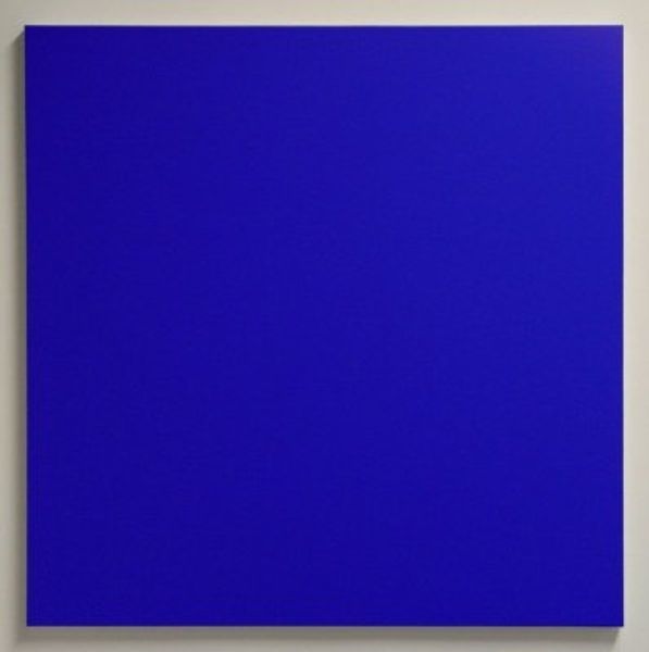
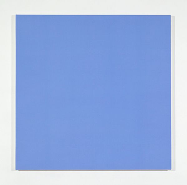
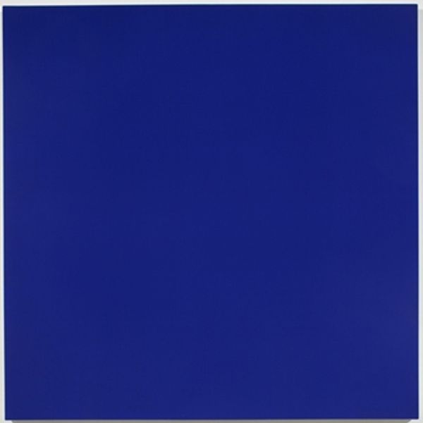
Editor: Here we have Rudolf de Crignis’s "Painting 98-19" from 1998. It’s essentially a monochrome blue square... but somehow, that expanse of blue is so captivating. What's your take? Curator: Captivating is a good word. For me, it whispers rather than shouts. I'm drawn to the idea of this almost pure field of color – it reminds me of Yves Klein’s blues, but softer. It invites contemplation, a deep dive into the subtleties of the color itself. Does it evoke any particular feelings or memories for you? Editor: I can see the resemblance to Yves Klein! It does feel like I could get lost in this blue. It’s serene, but also intense. Does the "negative space" tag refer to that kind of contemplative depth? Curator: I think it speaks to the way the painting exists in the gallery space. The painting *is* the figure and everything around it – the white wall, the architecture, the viewer – becomes the ground. Do you think that white surrounding amplifies the blue or diminishes it? Editor: That's a great way to put it. I think the white border intensifies the blue by providing stark contrast. Without that, the painting might feel less... defined, maybe? Curator: Exactly! And that tension, that interplay, makes it a rewarding piece, I think. Colour Field paintings, like this, challenge us to really *see*. And feeling the work? Editor: I see that this is all about the emotional response of this abstract world. Thanks so much. Curator: Indeed. A single colour becomes an universe. Thank you, it was nice to share thoughts.
Comments
No comments
Be the first to comment and join the conversation on the ultimate creative platform.
More like this