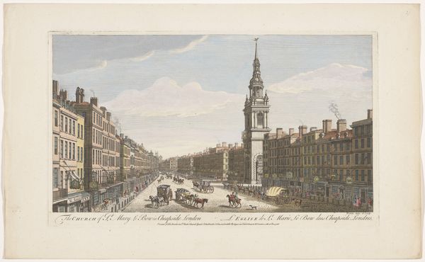
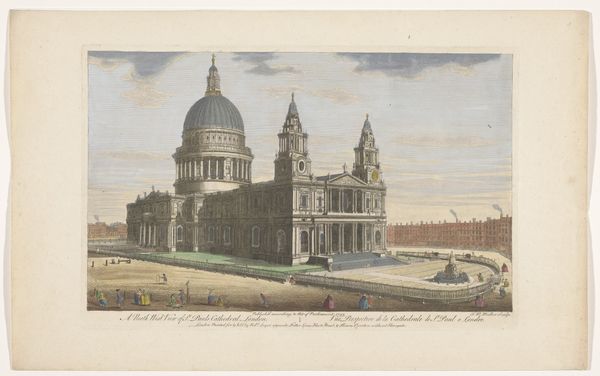
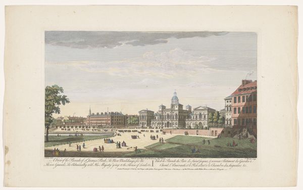
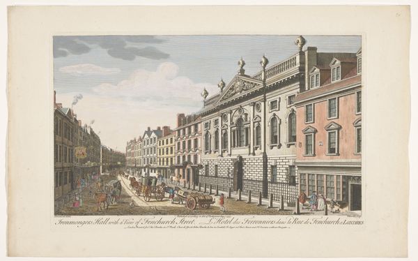
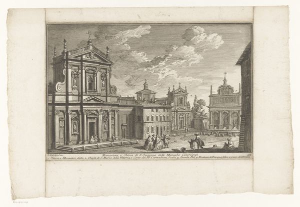
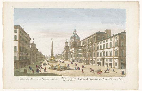
print, etching, watercolor, architecture
water colours
baroque
etching
landscape
watercolor
cityscape
watercolour illustration
history-painting
architecture
Dimensions: height 259 mm, width 402 mm
Copyright: Rijks Museum: Open Domain
Editor: Here we have Robert Sayer's "View of the Church Saint Bride's in London," a print with etching and watercolor from 1753, currently held at the Rijksmuseum. I'm immediately struck by the composition; it feels so carefully ordered and precise, almost mathematical in its layout. What stands out to you, considering the way the artist organized these forms and colors? Curator: The rigor in Sayer's articulation of space is indeed compelling. Note the clear demarcation of planes: the foreground square, the middle ground occupied by the buildings, and finally, the background sky. It invites a semiotic analysis. Each building is rendered with distinct linearity. The colour palette reinforces spatial depth through contrasting pastel tonality to communicate visual planes. Sayer's perspective control speaks to Baroque visuality that embraced order and mathematical logic as fundamental in conveying understanding. Editor: So the formal qualities—the lines, colors, and perspective—tell us something important about the artist's approach and perhaps even the values of the time? The almost muted watercolour palette makes it so different from other Baroque examples I've seen. Curator: Precisely. Baroque works weren’t exclusively awash with vivid colours. The strategic use of light and shadow alongside geometric articulation directs the viewer’s gaze, communicating a certain idealised, structured vision of urban life. The atmospheric watercolour wash contributes, texturally, to a particular reading; this is more than mere documentation of buildings, more so about constructing an atmosphere of organised human activity. What does this level of detail bring forth? Editor: I hadn’t considered that! Now I see that the lack of expressive colour maybe emphasizes that order even more. Thinking about composition now, it strikes me how much visual weight that large steeple commands. Curator: The steeple undoubtedly acts as a vertical anchor within the landscape. It’s relationship with St. Paul’s helps direct and determine your understanding of the whole image. Have we discussed how the etching and watercolor, work independently yet rely on each other? Editor: That’s really fascinating. The way you’ve explained the interplay between composition and technique gives me a much richer understanding of this print.
Comments
No comments
Be the first to comment and join the conversation on the ultimate creative platform.