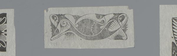
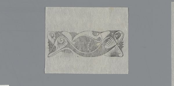
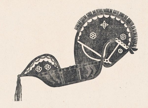
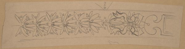
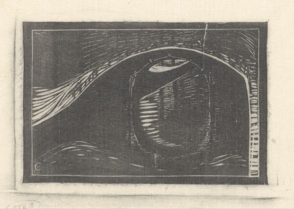
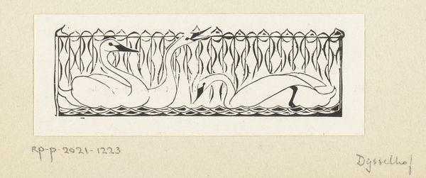
Staartstuk voor het prospectus van het Tijdschrift voor vercieringskunst 1896
0:00
0:00
drawing, graphic-art, ink
#
drawing
#
graphic-art
#
art-nouveau
#
ink
#
geometric
#
decorative-art
Dimensions: height 40 mm, width 260 mm
Copyright: Rijks Museum: Open Domain
This "tail piece" for a journal prospectus was designed by Karel Petrus Cornelis de Bazel. It's a small but striking black ink drawing on paper. The piece's power lies in the contrast between the graphic boldness of the black ink and the delicacy of the paper. De Bazel's technique would have involved meticulous hand drawing. Every line and curve carefully placed to create a sense of rhythm and visual interest. The process is laborious, demanding control and precision. While this piece is small, it speaks to larger themes. The journal itself was dedicated to 'vercieringskunst', or decorative arts, a field that often blurred the lines between art and craft. De Bazel's design, with its handmade quality, elevates the status of craft and making, emphasizing the skill and artistry involved in its creation, which is a welcome divergence from industrial production. This piece reminds us that true understanding comes from appreciating not just the final form, but the materials, the making, and the context.
Comments
No comments
Be the first to comment and join the conversation on the ultimate creative platform.
More like this