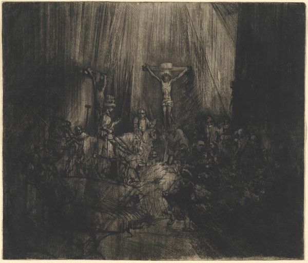
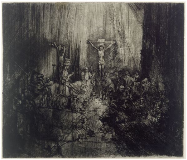
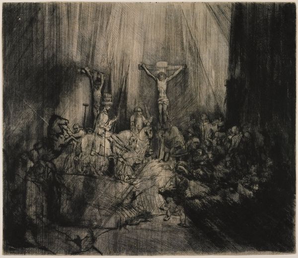
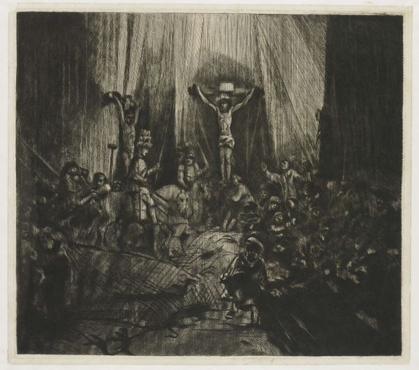
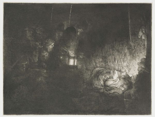
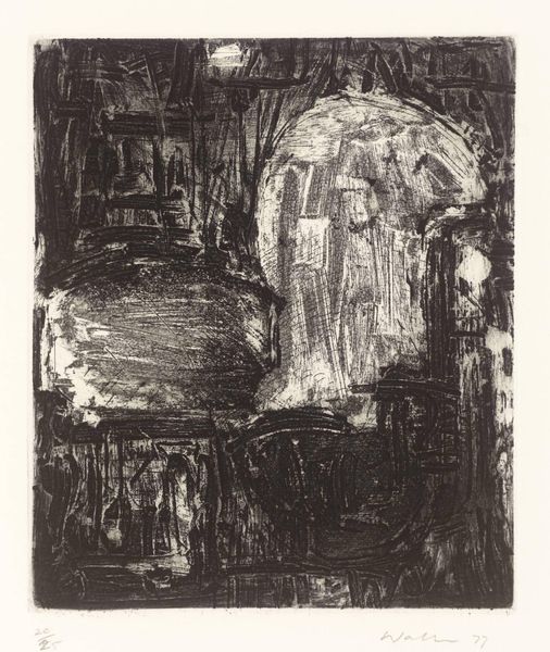
Christ crucified between the two thieves: large oblong plate (the "Three Crosses") 1653
0:00
0:00
print, engraving
#
baroque
# print
#
figuration
#
line
#
history-painting
#
engraving
Dimensions: 384 mm (height) x 448 mm (width) (bladmaal)
Editor: Here we have Rembrandt van Rijn’s "Christ crucified between the two thieves," or more commonly known as "The Three Crosses" from 1653, an engraving printed on paper. The stark contrast between light and shadow immediately grabs my attention – it creates a really intense and dramatic atmosphere. What compositional elements stand out to you in this piece? Curator: Indeed, the dramatic chiaroscuro is a key formal element. Notice how Rembrandt employs dense, almost chaotic lines to create areas of profound darkness, particularly on the right side of the composition and in the crowd at the bottom. This intense blackness then contrasts sharply with the relative lightness surrounding Christ on the central cross, achieved through much sparser and cleaner line work. Editor: So, it's about guiding the viewer's eye, is that right? Using light and dark to draw attention. Curator: Precisely. The very composition hinges on this visual polarity, directing our focus not merely to the event of crucifixion, but also establishing a visual hierarchy. Consider, too, the sheer physicality of the lines themselves, varying in weight and direction to create a tactile sense of depth and texture. Do you see how certain figures emerge more distinctly from the darkness? Editor: I do, particularly around the base of the cross. Is that contrast perhaps a statement about who witnessed this event? The texture also gives an immense sense of scale, a feeling of vast space and many figures, from a relatively small work. Curator: An astute observation. It speaks to Rembrandt's command of line as a formal tool and suggests avenues of interpretation about witnessing, belief, and doubt, all coded through pure visual language. Are there elements here that give a sense of imbalance? Editor: It definitely feels lopsided somehow. More weight on the right of the image, perhaps suggesting instability. It makes you feel uneasy. Thanks, I’ve certainly learned a lot about how formal analysis reveals visual storytelling here. Curator: Likewise, understanding art through its intrinsic elements gives a deeper meaning. It refines our focus on its core purpose and form.
Comments
No comments
Be the first to comment and join the conversation on the ultimate creative platform.
More like this