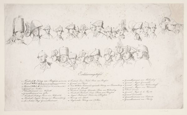
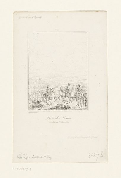
Verklaring van een prent met Frederik II van Pruisen 1758 - 1831
0:00
0:00
johanfrederikclemens
Rijksmuseum
drawing, print, pencil, engraving
#
portrait
#
drawing
#
neoclacissism
#
hand-lettering
# print
#
old engraving style
#
hand drawn type
#
hand lettering
#
personal sketchbook
#
hand-drawn typeface
#
fading type
#
pencil
#
15_18th-century
#
sketchbook drawing
#
history-painting
#
academic-art
#
sketchbook art
#
engraving
#
small lettering
Dimensions: height 315 mm, width 420 mm
Copyright: Rijks Museum: Open Domain
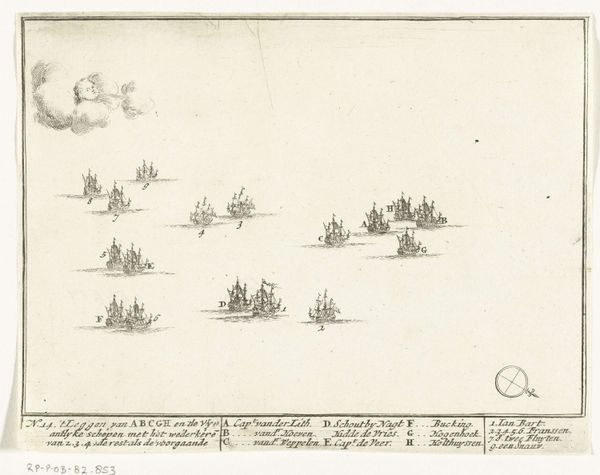
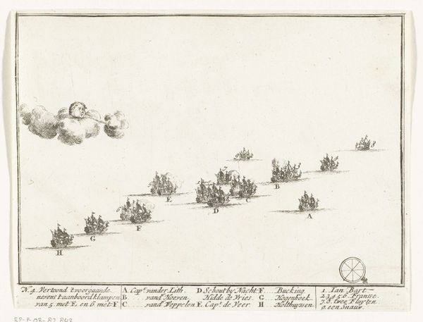
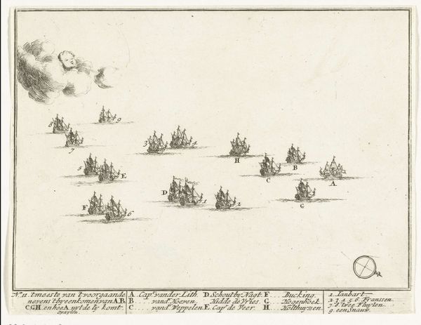
Curator: This is “Explanation of a print with Frederick II of Prussia,” made sometime between 1758 and 1831 by Johan Frederik Clemens. It’s a drawing and print of a portrait, currently held at the Rijksmuseum. It definitely looks like an… ambitious piece, a multitude of faces gazing back at you. The sheer number of figures, neatly arranged, gives it a certain... visual tension. What do you see in the piece, focusing on its compositional structure? Editor: Well, the layout immediately strikes me. There's a distinct hierarchy, a tiered arrangement of heads and hats, all meticulously rendered in what looks like pencil and engraving. The limited color palette – almost monochromatic – emphasizes the lines and forms. But what’s most compelling is how the faces are presented – a mix of individual portraits and group dynamics all in a singular composition. The meticulous composition, and tonal gradations guide the eye. Do you notice how the shapes are repeated throughout? Curator: Indeed. Observe the recurring motif of the hat, each varying slightly in form and ornamentation, yet contributing to a unified visual rhythm. How do these shapes interact with the blank space surrounding them? Editor: The white space really accentuates the detail in the faces and the hats. It almost isolates them, forcing you to consider each one individually, even though they are part of this collective portrait. The engraving technique lends itself beautifully to this contrast. It appears so exact, precise in its line work. The image has no shading except the shading it makes itself. Curator: Precisely. Consider also the calligraphic elements. The text at the bottom and the lettering of names creates a fascinating interplay between representation and abstraction, inviting further analysis of how the text contributes to the overall form. Editor: I see what you mean. It is integrated so well, almost like a texture. It definitely adds a layer of depth, like a key to understanding the characters we are seeing. I never thought about type having such significance in a visual sense. Curator: It all contributes to a delicate balance. This piece serves as a testament to Clemens' keen eye for structure, line, and the intrinsic properties of form. Considering the piece as a whole, focusing on form and how the various formal elements complement and contrast each other really enhances one’s understanding. Editor: This experience really underscored the power of composition. It's fascinating how simply observing a piece through this lens unlocks a whole new layer of meaning and appreciation.
Comments
No comments
Be the first to comment and join the conversation on the ultimate creative platform.
More like this