About this artwork
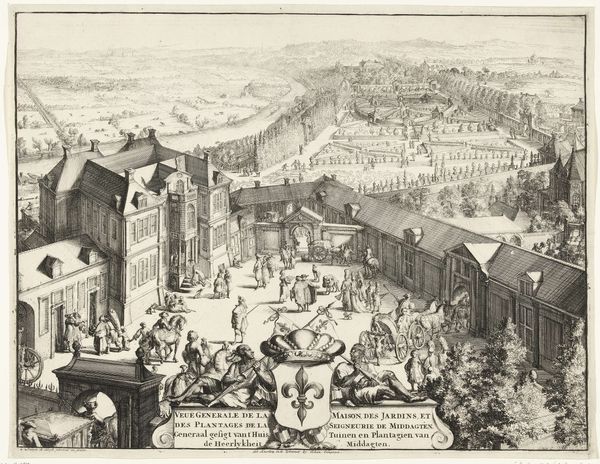
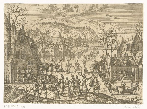
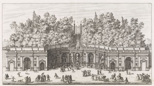
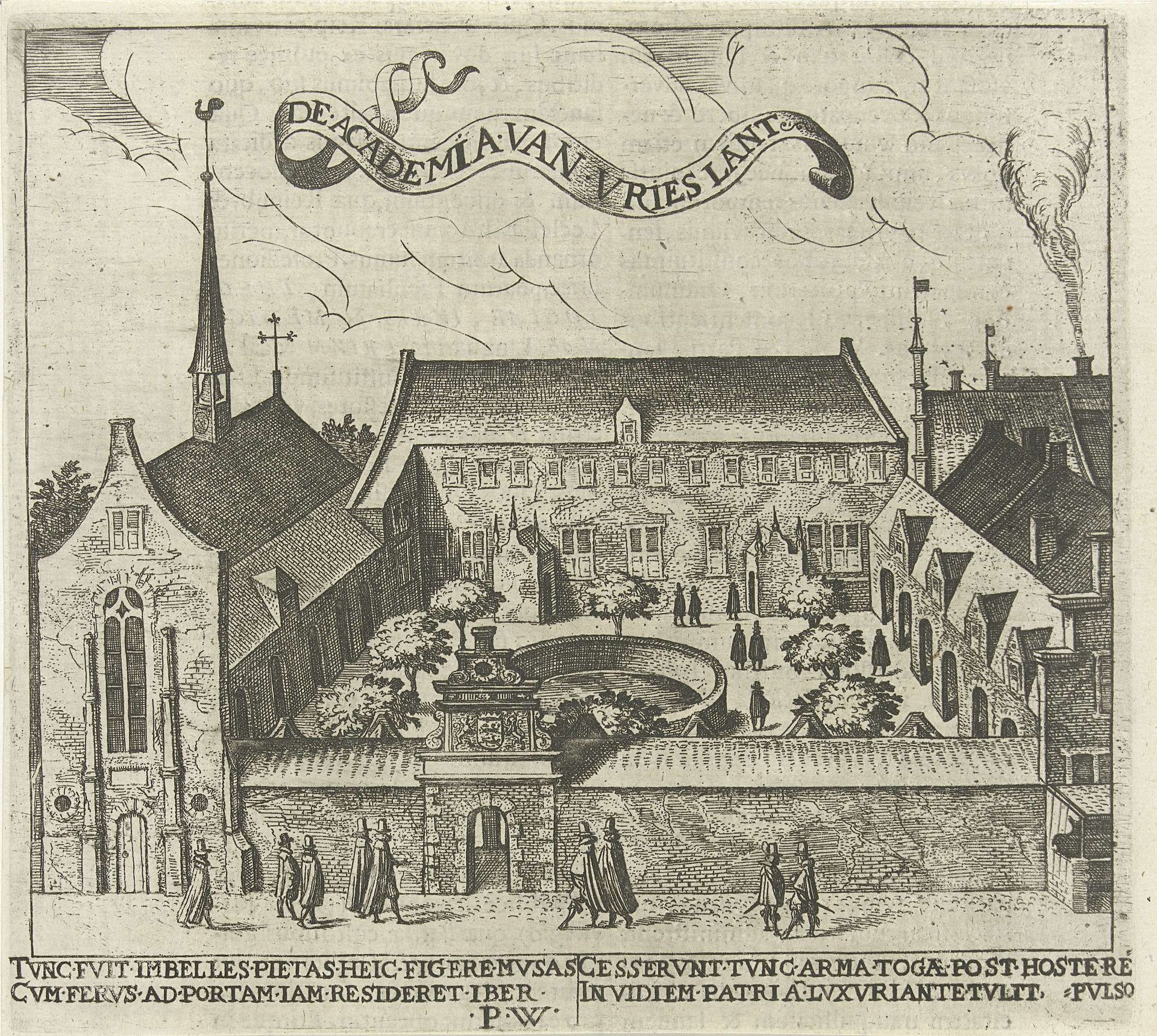
Editor: So, this print is titled "Universiteit van Franeker," and it's by Pieter Feddes van Harlingen, made sometime between 1611 and 1623. I’m struck by the intricate detail, especially considering it's an engraving. How do you approach analyzing a piece like this from a formal perspective? Curator: We can begin by considering the relationship between line, form, and space. Notice the linear precision of the engraving technique itself. The artist creates depth not through shading in a tonalist manner, but through careful modulation of line density. This lends a certain geometric rigor to the architecture depicted. Editor: So, it’s less about replicating reality and more about a structured representation? Curator: Precisely. Consider the architectural structure itself. Observe how the buildings are rendered. Are they presented with perfect orthogonal accuracy? Or is there a degree of artistic license taken with perspective to enhance visual interest or perhaps convey a specific symbolic intent? Editor: I see what you mean. Some of the angles seem slightly off, maybe to show more of the courtyard. Curator: It’s the interplay between idealized form and observed reality. This tension enlivens the work. Then examine the foreground figures – how do they relate in scale and proportion to the buildings? Is it about accurate scale, or do the figures fulfill another compositional role, drawing the viewer into the architectural space? What semiotic systems can we use to study and explore their meaning? Editor: They seem to guide my eye toward the entrance. I’m learning to look beyond just "what" is shown to "how" it’s shown. Curator: Precisely! Form dictates content, line dictates form. Looking at the print like this provides us a deep appreciation.
Artwork details
- Medium
- print, engraving, architecture
- Dimensions
- height 164 mm, width 180 mm
- Location
- Rijksmuseum
- Copyright
- Rijks Museum: Open Domain
Tags
Comments
Share your thoughts
About this artwork
Editor: So, this print is titled "Universiteit van Franeker," and it's by Pieter Feddes van Harlingen, made sometime between 1611 and 1623. I’m struck by the intricate detail, especially considering it's an engraving. How do you approach analyzing a piece like this from a formal perspective? Curator: We can begin by considering the relationship between line, form, and space. Notice the linear precision of the engraving technique itself. The artist creates depth not through shading in a tonalist manner, but through careful modulation of line density. This lends a certain geometric rigor to the architecture depicted. Editor: So, it’s less about replicating reality and more about a structured representation? Curator: Precisely. Consider the architectural structure itself. Observe how the buildings are rendered. Are they presented with perfect orthogonal accuracy? Or is there a degree of artistic license taken with perspective to enhance visual interest or perhaps convey a specific symbolic intent? Editor: I see what you mean. Some of the angles seem slightly off, maybe to show more of the courtyard. Curator: It’s the interplay between idealized form and observed reality. This tension enlivens the work. Then examine the foreground figures – how do they relate in scale and proportion to the buildings? Is it about accurate scale, or do the figures fulfill another compositional role, drawing the viewer into the architectural space? What semiotic systems can we use to study and explore their meaning? Editor: They seem to guide my eye toward the entrance. I’m learning to look beyond just "what" is shown to "how" it’s shown. Curator: Precisely! Form dictates content, line dictates form. Looking at the print like this provides us a deep appreciation.
Comments
Share your thoughts